

Testing styles for the Pretty Mac landing page

PH Community 👋
We're designing the Pretty Mac App landing page. And I'm trying something new.
Instead of just shipping what I think is right, I'd love to get your feedback!
Which direction would you go for? Which one talks to you? Open to your thoughts:
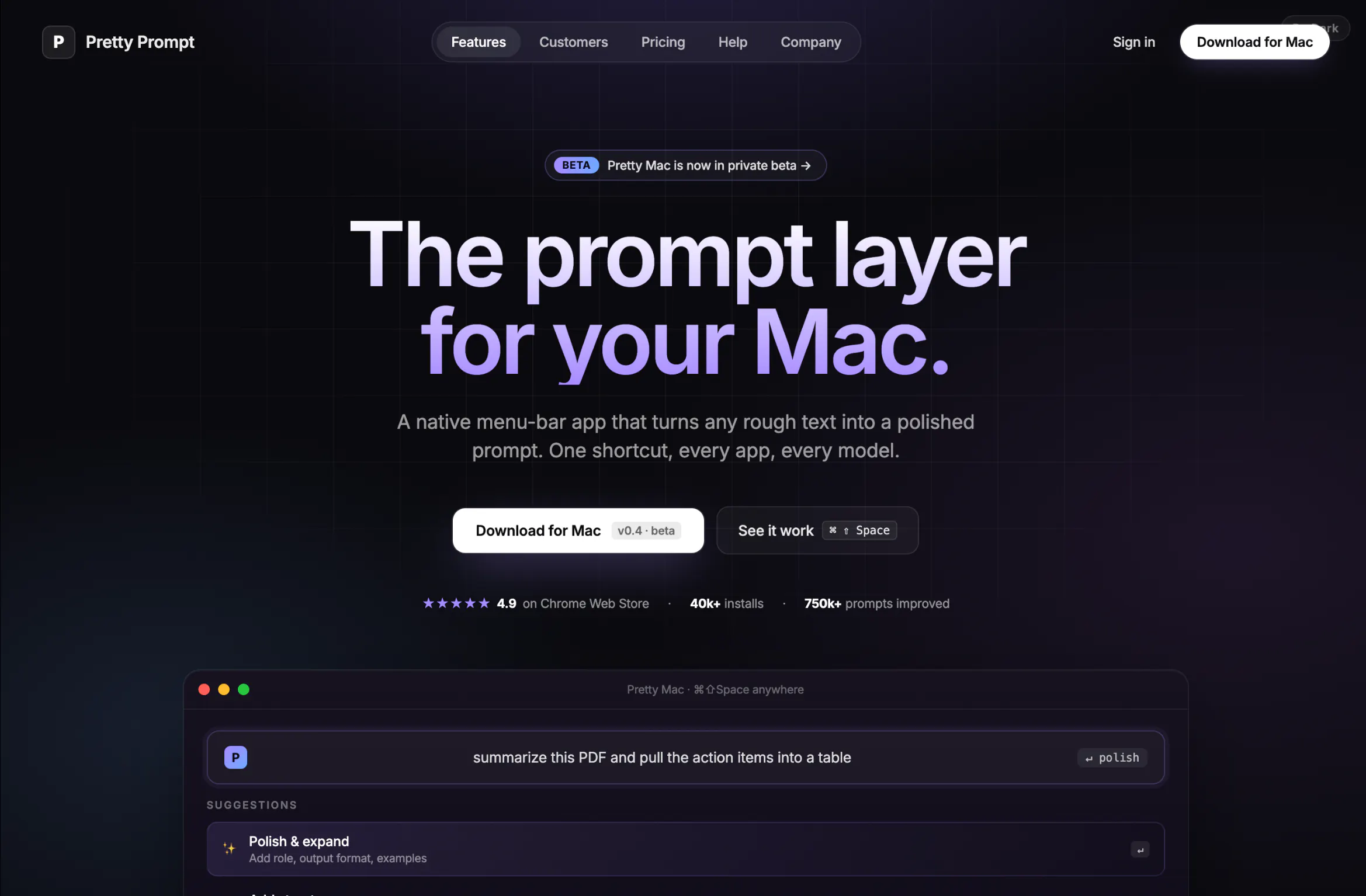
A. Raycast-style Near-black + grid. Centered pill nav. White CTA with a purple glow under the Mac window. Dark, sharp, developer.
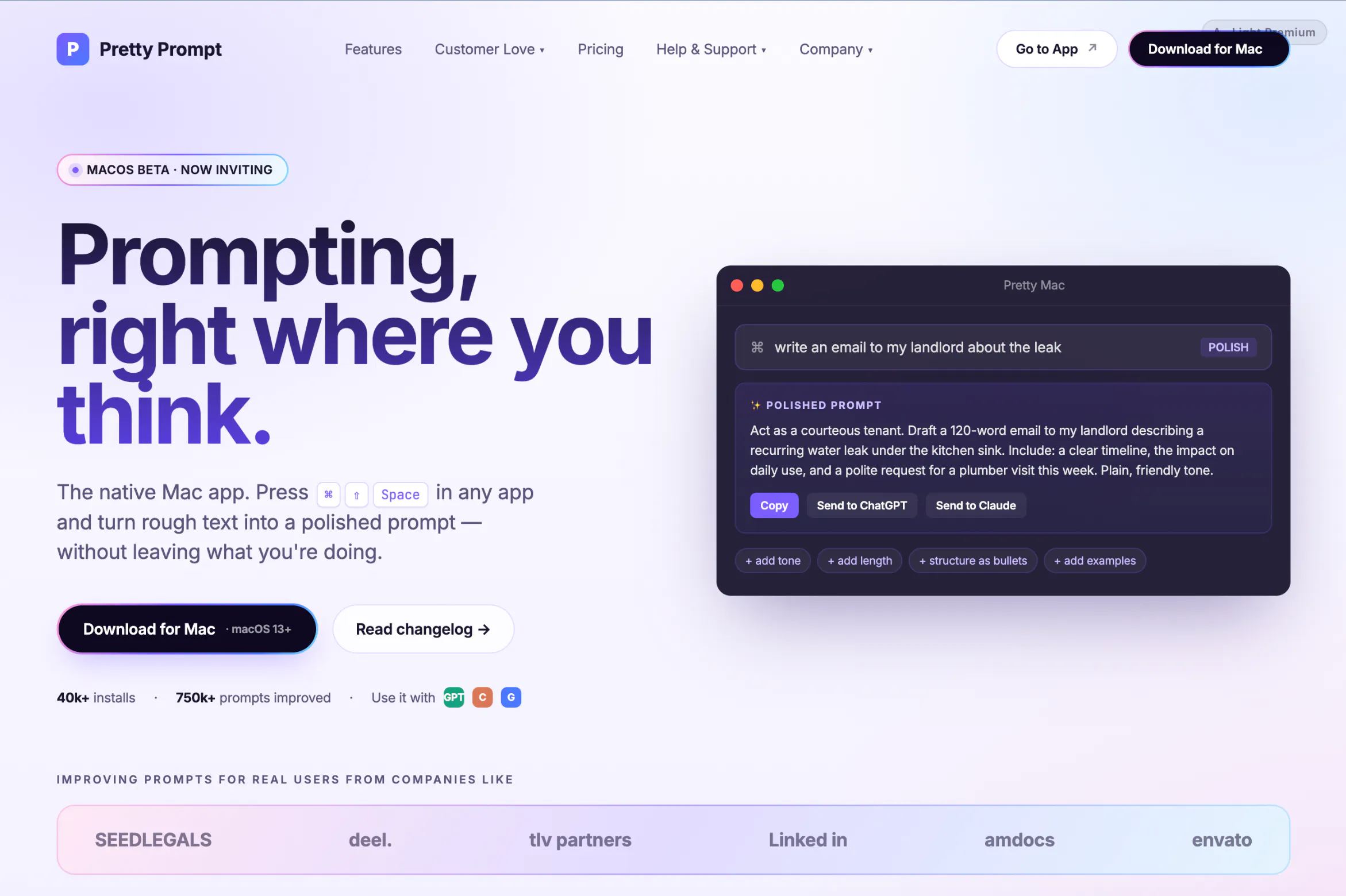
B. Light premium Off-white with a soft purple/blue/pink wash. Dark hero text with a subtle purple sheen. Feels polished. Feels expensive.
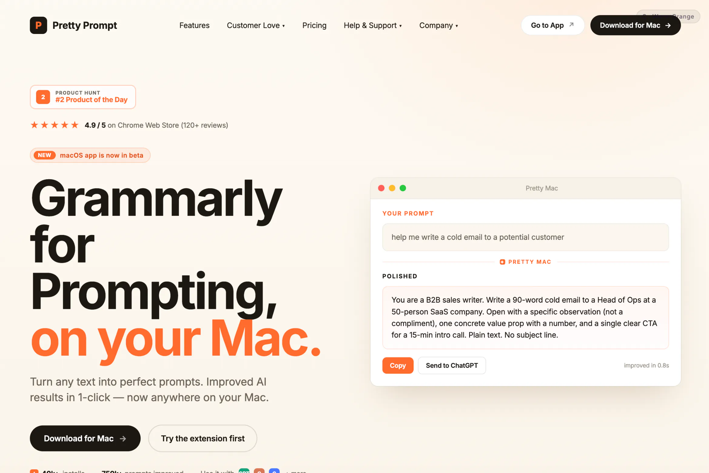
C. Warm light Left-aligned headline. Product Hunt trust row. Yellow swapped for orange. Similar structure to the landing page.
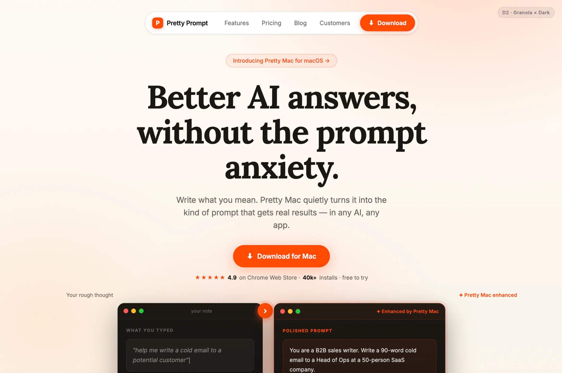
D. Editorial headline. Orange-amber accent. Gradient background, centered pill navbar. Rounded buttons, Granola layout.
Let me know your vote (A / B / C / D) in the comments (please 🙏)
And tell me why, that's the part I actually need. 😅
(And if anyone's up for beta testing hit me up)
Replies
I’d probably choose B or D, depending on who you most want to convert.
For “Grammarly for prompting,” B feels easiest to trust: premium, calm, and useful for non-dev knowledge workers who may not identify with a dark developer aesthetic. D could work if the product is positioning itself more as a taste/quality tool — less “prompt utility,” more “write better instructions and get better outputs.”
I’d be cautious with A unless the Mac app is mainly for developers. Raycast-style design signals power-user/dev tool immediately, which is good if that’s the ICP, but it may narrow the audience too early.
One thing I’d test separately from style: lead with before/after examples above the fold. Prompt tools are easiest to understand when the visitor can see “messy ask → sharper prompt → better result” in 5 seconds.
@jim_jeffers Amazing feedback. How's this?
I love them all. But im wondering is there a way to offer night and day toggle. I'm living in an environment where when it suns its sunny very much.
D is really appealing to me - no real reason, just gut feeling and nice colours (not that the other designs look bad)