

Thoughts on the new product/hub redesign?
by•

Product Hunt has launched a significant reconfiguration of the product hub — embedding launches within a company's or hub's frame:
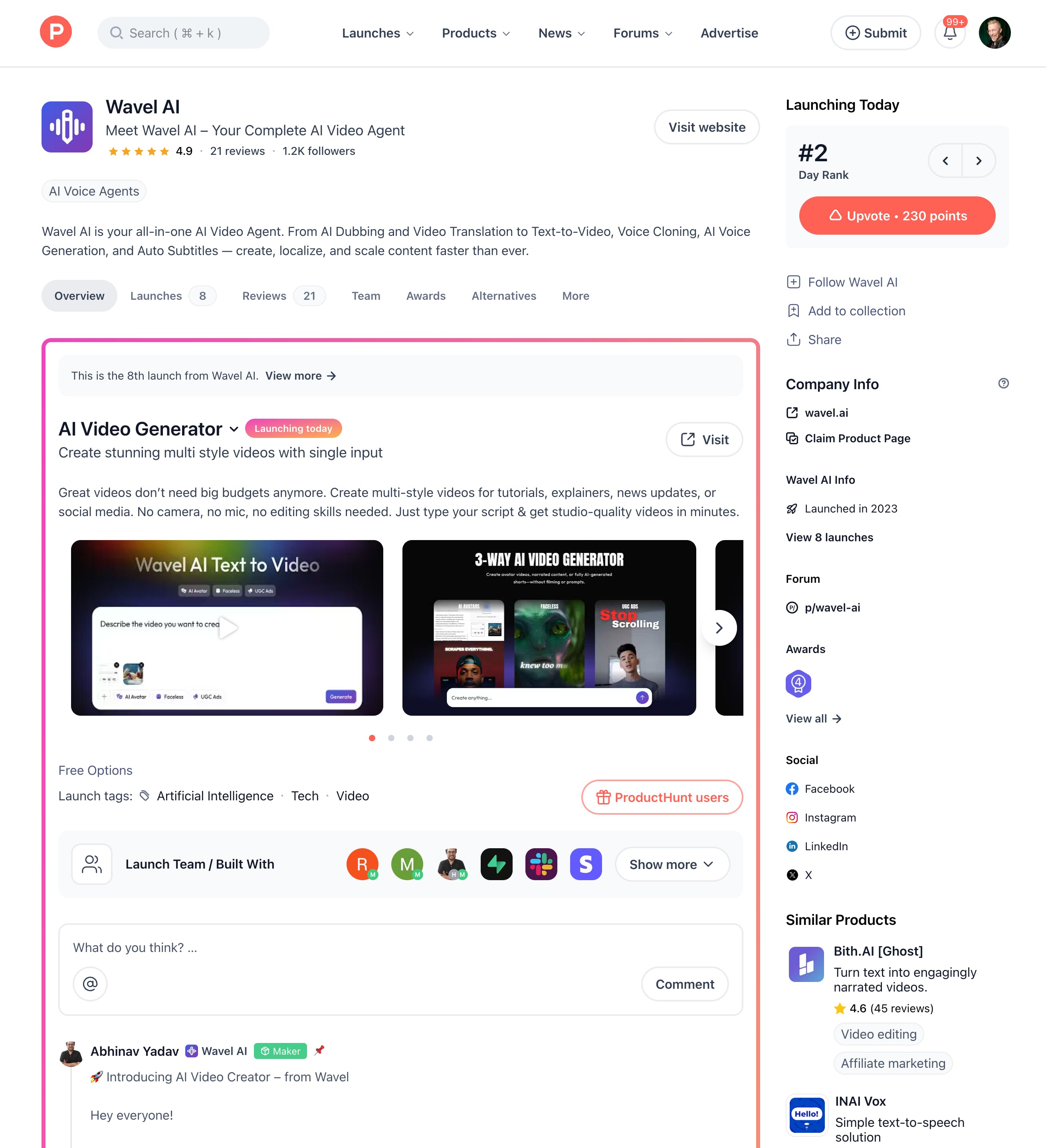
The upvote button (which now reports total points) is to the top right, and the right rail has also been redesigned.
417 views
Replies
not a fan tbh
IXORD
I don't really like it when the design changes like that, but it's only the first two weeks when I get used to it :)
Foundity
Took a couple seconds of staring at it but I'll adjust.. maybe
Lancepilot
Noticed this.
I thought I misclicked somewhere when I didn’t see the old one… The new design offers a more compact layout, but I guess we all just need to get used to it :)
Jo
One more UX confusion feedback -> with the Athena launch page today. It is somehow listed as a new launch by 'Kaizala chat app' - it is really confusing with seemingly no connection between the two. The listing says Athena on the PH homepage but when I click in, what I saw on top was Kaizala. What made this worse was the 'Visit Website' is broken - goes to a 'page not found' on MSFT's website.
This was maybe a simple mis-tagging issue (just an assumption) since it was hunted by @zaczuo and not the makers, but in the older design this would not be an issue as the launch itself - Athena - would be highlighted.