

Which platform has proven to you as the best for creating product landing pages?

I am at the stage of building a landing page for my Chrome extension tool.
That one will be created via vibecoding.
Which model/tool gave you the best results?
I tried Codex, V0, and Lovable – so far, Lovable gave me the best result.
Maybe I am missing other (better) options.
What would you recommend to me for the best-looking vibecoded websites?
(If you have a recommendation on how better website could look like and what it should contain, I am open to suggestions.) :)
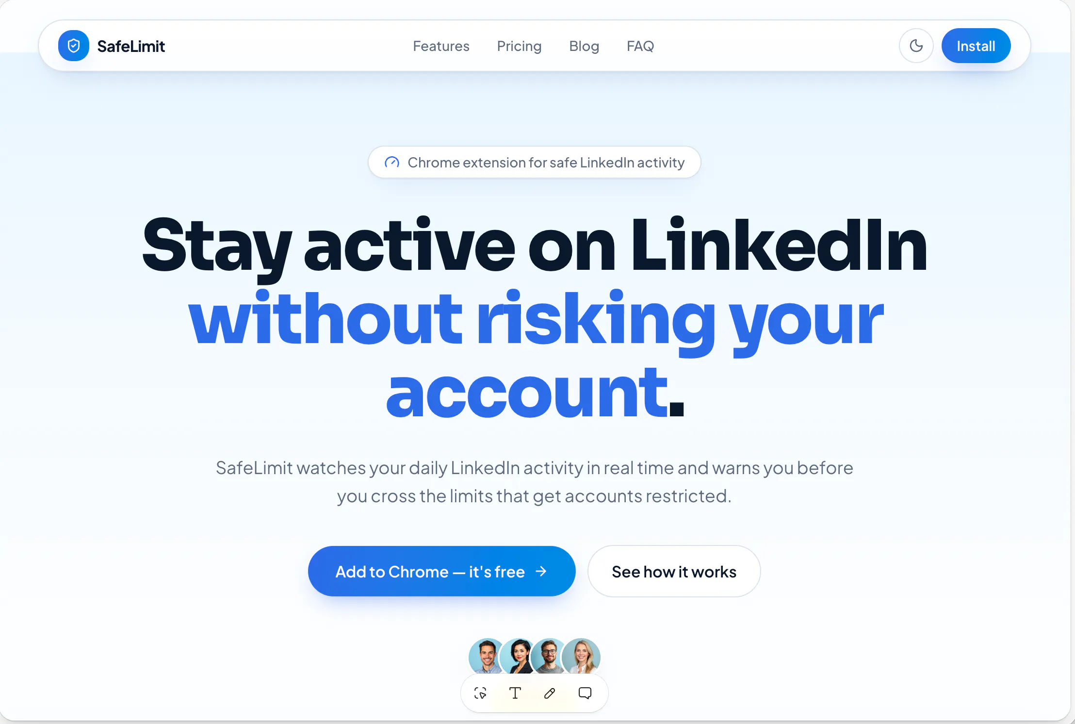
This is the output, BTW:
145 views
Replies
@hira_siddiqui1 are we connected on LI? :) I would like to avoid WP since every plugin update can damage the website :D
@busmark_w_nika sent you a LI request. and you are right about WP :P
@hira_siddiqui1 Cool gonna message you :)
Lovable is a fine pick, at this point the tool matters less than the brief you feed it. On what the page should contain: one promise in the headline, one screenshot doing real work, and the install button above the fold, everything else is decoration. I'd write the headline before opening any builder, it keeps the page honest.
@yelyzaveta_kibets What about this headline?
@busmark_w_nika The screenshot renders too small for me to read the headline text, so paste the words here and I'll react to them properly. The test I use is whether the headline names the change in the reader's life instead of the mechanism. For a screentime tool I'd push toward something like Make your phone boring again, because boring is the outcome people are actually buying.
@yelyzaveta_kibets Actually, this is for SafeLimit – LinkedIn Chrome extension, and the text is:
Stay active without risking LinkedIn restrictions
SafeLimit monitors your LinkedIn activity in real time and warns you before you reach risky engagement levels that could trigger LinkedIn profile restrictions.
I didn't come up with more :D
@busmark_w_nika That headline works, but the body says restrictions twice and never says the number, and the number is the whole reason someone installs this. If you know the real daily ceiling before LinkedIn flags you, would you put it straight in the subhead?
Went through this same evaluation two weeks ago. Lovable is the strongest of the vibe-coded options: agree with you. Ceiling hits when you want unusual layouts or specific typography.
Underrated pick: Framer with AI. Not strictly vibe-coding, but if the goal is best-looking page in least time, it wins. Templates are designer-grade, better SEO out of the box.
Claude Code + a Tailwind starter, highest ceiling, worst time-to-first-draft. Only worth it if the landing page is going to grow into a product surface with gated content, calculators, auth, etc.
One thing though, most vibe-coded landing pages fail on positioning, not looks. Write your hero in one line (who it's for + what outcome) before picking a tool. And for a Chrome extension: 10-second demo GIF above the fold beats any hero illustration.
@vinay_k10 can you pin any website where you really liked the look?
@busmark_w_nika here a few I keep coming back to (personal taste, your mileage may vary)
linear.app, the gold standard. Confident, every section earns its place.
posthog.com, playful but not too much, and the product screenshots are integrated into the narrative instead of dumped in a gallery.
attio.com, closest to what a beautiful SaaS site looks like in 2026. Great typography.
cal.com, for something simpler and closer to what you're building.
For chrome extension specifically look at 1password.com and grammarly.com hero sections both nail the show the extension in action in the browser chrome move.
Don't copy any of them directly. Pick one screenshot the sections you like and ask yourself why each choice works before adapting it.
@vinay_k10 thank you for the references. These are pretty too far (probably designed by someone who understands UX/UI. So I have something to do with myself :D
Same experience with Lovable versus Codex and V0, but the tool matters less than what happens after the first generate. All three produce the same generic look out of the box, purple gradient hero, rounded cards, centred headline, because they are trained on the same template patterns. What actually fixed it for me was picking a specific design direction before generating anything, real references and real fonts, not the default Inter and Geist everyone ships with. The floating icon grid and the fake dashboard screenshot mockup are the two things I now delete on sight, they are what makes a page read as AI generated more than any single tool's output does.
@oshylabs What would you advise me to do with my design to make it look less AI-generated?
@busmark_w_nika Two changes matter more than model choice. Swap whatever font Lovable defaulted you into, it will be Inter or a Geist clone, for something with slightly more character. That alone breaks the generated look before anyone reads a word. Then replace any decorative element, icon grids or a fake dashboard mockup, with an actual screenshot of SafeLimit running inside a real LinkedIn tab. Generated pages illustrate a concept. Real products show the thing working.
Vinay's 1Password and Grammarly picks are the ones to copy directly for a Chrome extension, hero showing the extension live in the browser chrome rather than floating in space. Since your whole pitch is staying inside safe limits, a shot of the warning firing on a risky action would do more than any illustration.
And chase the number Lisa raised. Risky engagement levels with no figure reads as generated copy, because a real product states the actual number. If you know the daily ceiling before LinkedIn flags an account, put it straight in the subhead.