

We just launched Artifacts by Databox - turn any answer into a shareable report

https://www.producthunt.com/products/databox?launch=artifacts-by-databox
It's the end of the month. Your client needs a performance report, so you open five tools, screenshot the numbers, paste them into Google Slides, and spend two hours making it look like you didn't just paste screenshots into Google Slides.
We just made that whole process unnecessary.
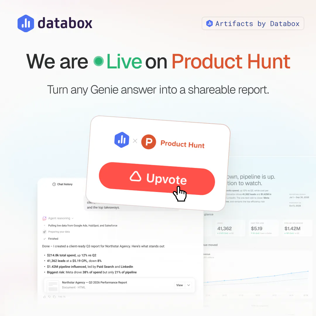
Artifacts by Databox lets you turn any Genie conversation into a polished, shareable document. Ask for a report, a slide deck, or even an interactive calculator, and Genie builds it on the spot, pulling live numbers straight from your connected data. No exporting, no re-pasting, no rebuilding the same report from scratch every cycle.
Share it with a public link, no login needed for whoever's on the other end. Download it as a PDF. Or just ask Genie to turn it into a different format, and it rebuilds the whole thing for you.
A question for this community: what's the report or deck you rebuild by hand every single cycle, the one you'd love to just ask for instead?
We're in the comments all day - questions, feedback, and pushback all welcome.
Replies
The two hours of pasting screenshots into Slides is a workflow I hear about constantly from the agency people I build for.
One question on the shareable report. When a client asks why a number moved, does the artifact answer that or does it come back to a person in Slack? I ask because the failure I keep hunting in my own tool is a generated summary that sounds sure about a cause it never checked. In reporting the client acts on the number, which makes it more expensive than in my case.
@vladimir_iudin Fair question, and worth being precise about. The numbers in the artifact are real, pulled directly from your connected sources, not estimated or invented. Any narrative Genie adds around them is grounded in that same data, it's not free-floating commentary.
But if the answer to "why did this move" requires context that isn't in the connected data (a campaign pause, a sales team change, something that happened outside the tool), Genie won't know that any more than a dashboard would. It can surface correlations in the data itself, but it doesn't have knowledge of things that never got recorded anywhere.
So the honest answer: the artifact is a good first pass at the "what" and often the "what changed alongside it," but for a genuinely unexplained number, a human still needs to confirm the cause before it goes to a client. We'd rather say that plainly than have someone find out the hard way.
most of the effort goes into rebuilding the same slides with fresh numbers.the analysis is the valuable part not the formatting.
@anthonywrinqsb Completely agree, that's the split we designed around. Genie does the analysis and writes the narrative around the numbers, then Artifacts handles turning that into a document, so the formatting stops eating time that should go to the analysis itself.
The part I would want on the artifact itself is the question. Whoever opens the link never saw the prompt, so they cannot tell whether a flat number means flat, or means the range stopped on the 20th. The person who asked knows. The person it gets forwarded to does not, and forwarding is the whole point of the feature.
The other one is what happens after you share. Live data means the report can say something different on Monday than it said when you approved it. Frozen means it goes wrong the other way. I do not think there is a right answer, but the reader cannot tell which one they are holding.
Which is it today, snapshot at share time or live?
@jernej_jan_kocica Snapshot today. What the recipient sees is frozen at the moment it was generated, it doesn't update after that. Live data is something we're planning next, but it's not there yet, so right now, "as of when I shared this" is the accurate framing.
Your first point is the sharper one honestly. A flat line and a range that just ended look identical to someone who wasn't in the room for the prompt, and that ambiguity is on us, not on the reader. The honest fix is that the artifact itself needs to carry that context (the date range, and ideally a note on why the range ends where it does) rather than relying on the person forwarding it to explain that verbally. That's not solved yet, and it should be.
@zigapotocnik snapshot is the right default for now, at least it cannot contradict itself later.
on the date range, the thing that would help me most is not the range, its why it ends there. up to yesterday because the sync runs nightly reads completely different from up to the 20th because that is what i asked for. same two dates, opposite meaning.
nice launch, #2 is well earned.
Congrats on the launch, and on #2. The workflow you're killing is a real one - the two hours of pasting screenshots is the visible cost, but the invisible one is that every hand-built report is a place a number can quietly drift from its source.
Jernej and Vladimir have already put a finger on the thing I'd care about most, so I'll just add the data-side framing. The report format isn't really the hard part - a shareable artifact from a prompt is a great convenience. The hard part is that the moment it leaves the room, it's detached from the two things that make a number mean anything: the question it answered and the definition it was computed from. "Revenue is flat" read by the person who forwarded it, and read by the exec three hops downstream, are different claims, and only one of them knows whether "flat" means flat or means the range ended on the 20th.
Your answer to Vladimir was the right one, and rarer than it should be - saying plainly that Genie can surface the "what" but a human still has to confirm an unexplained "why" is exactly the line most tools blur. The failure mode worth designing against is the confident, beautifully formatted answer that's grounded in the wrong definition, because it survives review: the reader approves it for the same reason it's wrong, it reads well.
So the feature I'd push toward, building on Jernej's point: make the artifact carry its own provenance - the date range, why the range ends there (nightly sync vs. "I asked for through the 20th," which as he says are opposite meanings on identical dates), which governed metric definition it used, and as-of timestamp. Not because readers will read it every time, but because it turns "trust me" into "verify me" for the one report in twenty where someone needs to. Snapshot-as-default is the right call for exactly that reason - a frozen artifact can't quietly contradict itself on Monday.
To actually answer your question: the deck I'd most want to never rebuild is the monthly cross-channel performance summary where half the metrics are defined slightly differently in each source tool - that reconciliation is the part that eats the time, and it's also the part most likely to go silently wrong.
@tony_tan10086 Thanks, and that's a sharp way to tie those two threads together. You're right that they're the same underlying problem: a number that's correct at the moment it's generated can become misleading once it's detached from the context of when and how it was defined, whether that's the date range or a metric definition changing behind it.
Baking that context into the artifact itself, not relying on the sharer to explain it verbally, is the right fix, and it's the direction we're headed. A visible timestamp and the definition it was built on travelling with the artifact solves for exactly the reconciliation tax you're describing. Appreciate you pushing on this, it's sharpening the roadmap for this in real time.
@tehreem_fatima5 Glad it landed, monthly marketing reports are one of the most common cases we hear about too, same charts, same layout, just fresh numbers every cycle. Rebuilding that from scratch is exactly the tax we wanted Artifacts to remove. Appreciate you checking it out.