

I built an extension to see any site's responsive layout right on top of the desktop
Hey everyone 👋
I'm a solo developer, and I built Mobile View to scratch my own itch: I was constantly toggling DevTools (or opening a separate responsive tab) just to check how a site looks on mobile vs desktop.
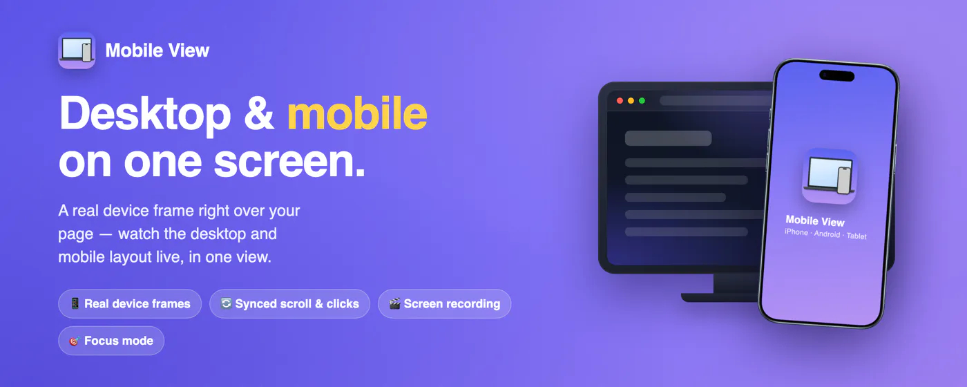
So I made a Chrome extension that drops a real phone or tablet frame right on top of the live page — so you see the desktop and the mobile-adaptive layout at the same time, in real time. Scrolling, clicks and typing stay in sync between the two. You can switch devices, rotate, set custom sizes and diagonals, take screenshots, record the screen, and use focus mode — all locally in your browser, no account, free.
I think it's especially handy for:
Developers — check responsive layouts without jumping into DevTools or a second tab
Designers & freelancers — present a site to a client live, on a real device frame
Portfolios — grab clean, presentable shots and videos for GitHub or to show an employer
It's an indie project I'm actively improving, and I'm launching on Product Hunt soon — would love it if you followed the page to get notified 🙏
Most of all, I'd genuinely love your feedback: how do you preview responsive layouts today, and what would make Mobile View more useful for your workflow?
🔗 Try it: https://mobileview.app
🧩 Chrome Web Store: https://chromewebstore.google.com/detail/hocbjiaeeijekejepphjihbpogikmofh
Thanks for reading!
Replies
Be the first to reply
Have a question or a thought to share? Add a comment above to start the conversation.