I'm a solo developer, and I built Mobile View to scratch my own itch: I was constantly toggling DevTools (or opening a separate responsive tab) just to check how a site looks on mobile vs desktop.
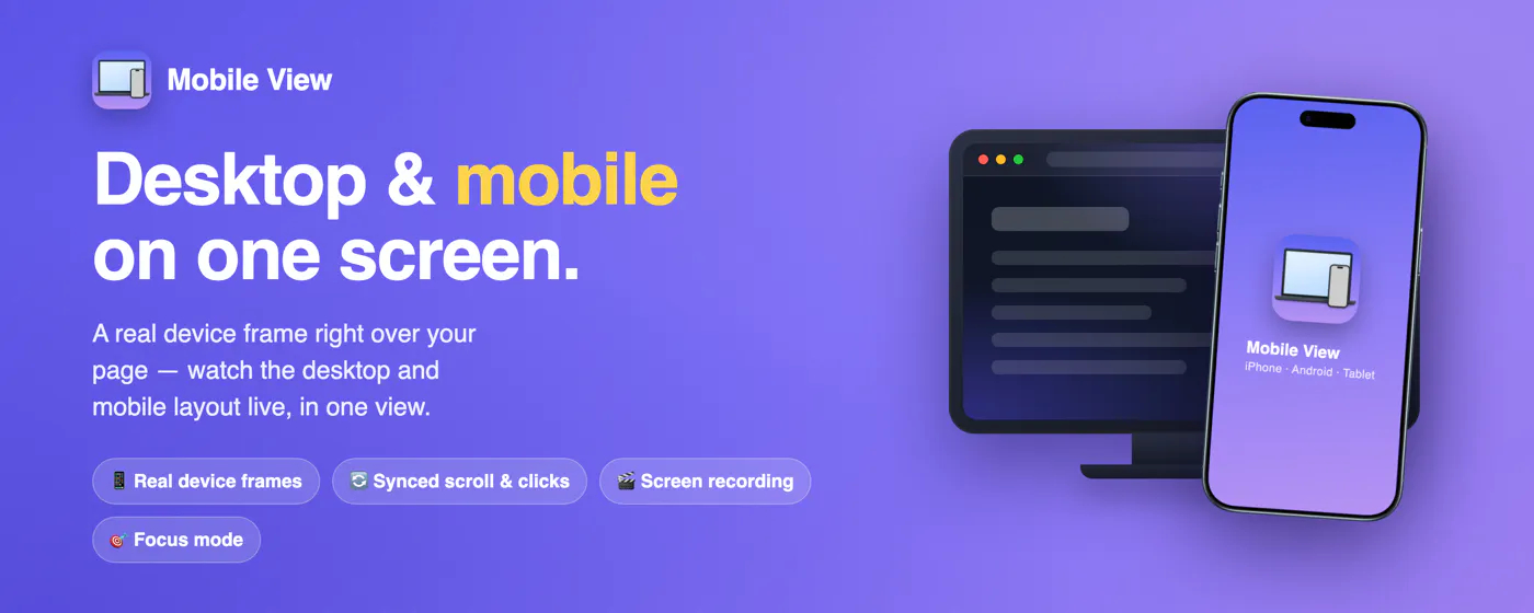
Mobile View overlays a real phone or tablet frame right on top of any live website, so you see the desktop and mobile layouts at the same time — no DevTools, no separate device. Scrolling, clicks and typing stay in sync across both. Switch devices, rotate, set custom sizes and zoom, change theme and language. Take screenshots or record the screen (WebM), use focus mode, and more. Works on any responsive site. Free, no account, runs fully locally in your browser.
I'm a full-stack web developer, and I built a free Chrome extension called Mobile View to solve something that kept slowing me down at work.
When you build responsive sites, you constantly need to check how a page looks on mobile while you're working on the desktop version and the usual options either hide one layout when you switch, or feel clunky. The part that really pushed me to build this was demoing work: when a client or an employer asks "how does it look on a phone?", screen-sharing a narrow browser window never looks great.