
Mobile View
See any site's desktop & mobile layout at once
16 followers
See any site's desktop & mobile layout at once
16 followers
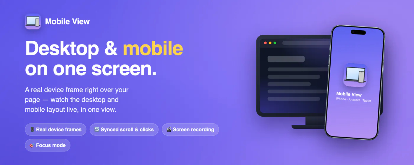
Mobile View overlays a real phone or tablet frame right on top of any live website, so you see the desktop and mobile layouts at the same time — no DevTools, no separate device. Scrolling, clicks and typing stay in sync across both. Switch devices, rotate, set custom sizes and zoom, change theme and language. Take screenshots or record the screen (WebM), use focus mode, and more. Works on any responsive site. Free, no account, runs fully locally in your browser.


Free
Launch Team / Built With


ArticosTest your messaging on your audience, right inside Claude or ChatGPT
Promoted


Hey Product Hunt 👋
I'm a solo dev, and I built Mobile View to fix my own daily annoyance: constantly jumping into DevTools (or opening a separate preview tab) just to check how a site looks on mobile vs desktop. I wanted to see both at once, right on the real page.
🖥️📱 What it does
Mobile View drops a real phone or tablet frame right on top of any live website, so you watch the desktop and the mobile-adaptive layout side by side, in real time. Scrolling, clicks and typing stay in sync between the two — no DevTools, no resizing windows, no separate tab.
✨ A few things it can do
Preview any responsive layout at any resolution / device size, directly over the running page
Switch devices, rotate, zoom
Take clean screenshots and record short videos of the preview
Works on any website; settings are saved across tabs
👤 Who it's for
Developers, designers and freelancers — whether you're presenting a site to a client, or creating polished, presentable screenshots and videos for a portfolio, GitHub, or to show an employer.
🤔 What makes it different
Most other tools still open the mobile view in a separate tab, so you're constantly switching back and forth — almost like DevTools. Mobile View keeps everything in one view, overlaid on the live page, which just feels more natural (and looks much better when you're presenting).
🔒 Free & private
Completely free, no account needed, and nothing ever leaves your browser — no analytics, no tracking.
It's already used by nearly 300 people with a 4.9★ rating, which has been hugely motivating as a solo dev. This is an independent project I'm actively improving, so I'd genuinely love your feedback — what's missing, what would make it more useful in your workflow?
👉 Chrome Web Store
🌐 Site
Thanks for checking it out! 🙏
Congrats on the launch! 🚀
This is actually very useful for developers and freelancers. Constantly switching between DevTools, desktop view, and mobile preview breaks the workflow a lot.
I like that scrolling, clicks, and typing stay synced. Curious if you plan to add side-by-side comparison screenshots for client approvals or before/after responsive testing.
@prashant_patil14 Thanks, Prashant! You described the exact pain I built it for.
Quick note — there's actually a "full" screenshot mode already: it captures the whole view, i.e. the mobile frame sitting right on top of the live desktop page, in a single image. So a desktop + mobile capture exists today.
If you mean a clean side-by-side layout though — desktop and mobile next to each other, neither overlapping, made specifically for client approvals / before-after comparisons — that part isn't there yet, and I think it's a great addition. Adding it to the roadmap.
I've been using the app for several months. It's very convenient.
I used to use DevTools to open a website on a mobile device. With Mobile View, testing websites has become much more enjoyable.
Special thanks for the screen recording feature.
Good luck to the developer!
@fizalion Thank you so much, Oleg 🙏
Really glad Mobile View made testing more enjoyable for you, and that the screen recording comes in handy — it was honestly one of my favourite features to build. If you ever hit something that's missing or have an idea, I'm all ears.
Thanks a lot for the kind words and the support on launch day!