
Databox is an AI-powered business intelligence and analytics platform for teams that need clear, trusted answers fast. It offers the best of BI, without the complicated setup, steep price, or long learning curve. It provides a blend of powerful, but easy-to-use, features, from preparing datasets and creating the custom metrics your company needs to track, to building beautiful dashboards, customizing your reporting, and receiving AI-powered insights.
This is the 8th launch from Databox. View more

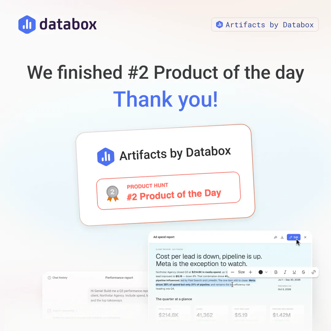
Artifacts by Databox
Launched this week
Turn any conversation with your AI Analyst into a polished report, slide deck, or interactive document built from your live data. Generate it from a single prompt, then share it via public link or download as a PDF.


Free Options
Launch Team / Built With


The question I get most on calls is some version of 'so once Genie answers, then what.' Before, the answer was a chat message. Now it's a finished report or slide deck with your actual data in it, shareable with a link. For prospects who need to show something to their team after a demo, that's a much easier story to tell.
Databox
@kenneth_won Love that framing, "so what happens after Genie answers" is exactly the gap we were closing. Nice callback for the calls, thanks for jumping in on the thread today.
Databox
Worth flagging for anyone who tried an earlier version of this: you can now edit text and titles directly inside the artifact panel, no prompt needed for small fixes. And every artifact you make is saved to its own gallery with search and favorites, so finding last month's report doesn't mean digging through chat history anymore.
Databox
@etiennegarcia That's the split we kept coming back to as well, getting the answer is only step one, turning it into something you can actually hand off is the part that eats the time. Thanks for the kind words, glad it landed.
Hey all! Weighing in here. From a technical standpoint, what makes this reliable is where the data comes from. The artifact isn't summarizing a pasted export, it's pulling from your live connected sources across 130+ integrations. That's the difference between a document that reads well and one I can actually stand behind in a meeting 💪🏻
Databox
@emil_korpar Nailed the technical distinction here. Summarizing a pasted export is the easy version, standing behind the number when someone asks "where did this come from" in a meeting is the bar we actually held ourselves to. Thanks for breaking that down for the thread.
Congrats on launch #8, Pete and team. The part I like is that it doesn't stop at the chart - it packages the analysis into something you can actually hand to someone. That last mile of turning an answer into a shareable artifact is where most BI tools quietly leave you. Nice work.
Databox
@ben_kahan Appreciate that, Ben. That last mile is exactly what we kept pointing at internally, an answer that stays in a dashboard doesn't travel, an artifact does. Thanks for the kind words.
This one clicked for me right away. You tell Genie what you actually did, so the report explains the result instead of just restating it. Dashboards were never the bottleneck. Nice work.
Databox
@lucasjpols Thanks Lucas. That's a good way to put it, dashboards were never the bottleneck, getting the "so what" out of them and into someone's hands was. Glad it clicked right away.
I really like that the reports stay connected to live data instead of becoming outdated static documents or PDFs.
Databox
@divya_kothari1 Good catch to flag, though worth being precise on what "live" means here. An artifact itself is a snapshot, once it's generated, the data inside it is frozen and won't auto-update. But you can re-trigger the same report anytime, and it'll pull fresh, live data from your source with no extra setup, no reconnecting, no rebuilding the prompt. So each generation reflects your current numbers, it's just that a single artifact doesn't refresh in place. Appreciate you digging into the details.