

Your UI Might Not Need a Redesign — It Might Need Better Colors
Most UI feedback sounds like this:
“Something feels off.”
But many times, the layout is not the problem.
It’s the color system.
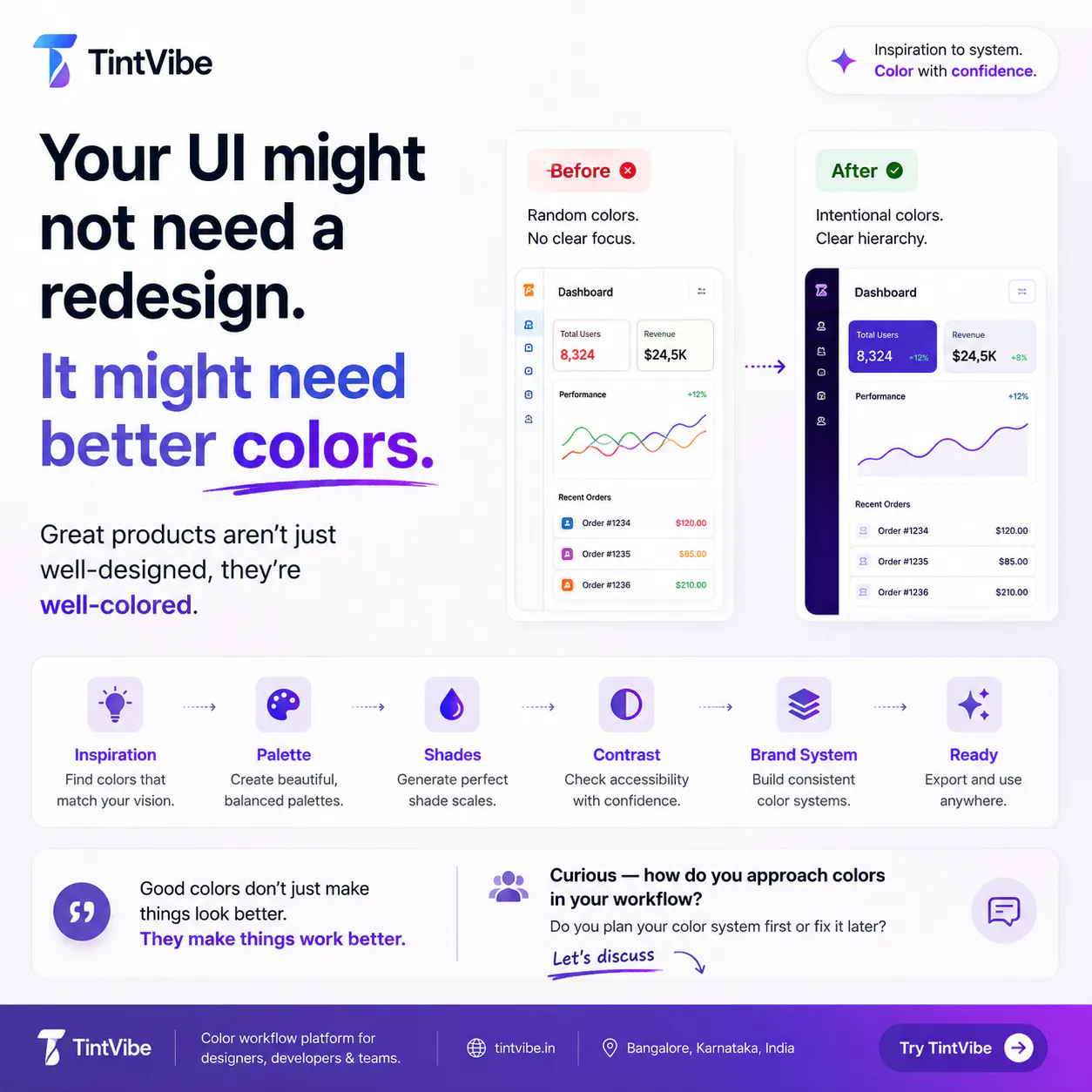
A product can have good spacing, clean cards, nice typography, and still feel weak if:
→ Every color is competing
→ CTAs don’t have clear priority
→ Shades are used randomly
→ Contrast passes but readability feels poor
→ Brand colors look good alone but fail together
I’ve been building TintVibe to solve this exact workflow:
Inspiration → Palette → Shades → Contrast → Brand System → Ready-to-use colors
The goal is simple:
Help designers and teams move from “these colors look nice”
to “these colors actually work in the product.”
Curious — when you design UI, do you plan your color system first or fix it later when the interface starts feeling off?
Replies