

Spixor: the next update: Drag & Drop improvements.

We’re currently working on one of the most important parts of the Spixor builder: the Drag & Drop experience.
This is still very much a work in progress, but we wanted to share a small behind-the-scenes look at what we’re improving.
At first, Drag & Drop sounds simple:
Pick up a block → move it → drop it somewhere.
But inside a visual website builder, it quickly becomes much more complex. The editor needs to understand where the user is pointing, what kind of content is being moved, what container it belongs to, how the layout should respond, and whether the final placement actually matches the preview.
That last part is the most important one for us:
If you drag something, you should be able to trust exactly where it will land.
Current work in progress
Right now we’re improving things like:
clearer placement previews
better visual drop zones
showing whether content will be placed before, after, inside, or as a new column
making column placement easier to understand
improving how Drag & Drop behaves inside nested layouts
making the source flyout less distracting while dragging
improving pointer-to-canvas alignment
preparing snap-like behavior so placements feel more natural
exploring cancel zones for when users drag outside the canvas
This is less about “does Drag & Drop technically work?” and more about:
Does it feel good?
Does it feel predictable?
Does the preview match the final result?
Can a user trust the builder?
Before / current comparison
Before:
The user mostly saw thin placement lines. Technically useful, but not always clear enough. It was sometimes hard to understand whether content would land inside a column, between two blocks, at the end of a section, or somewhere else.
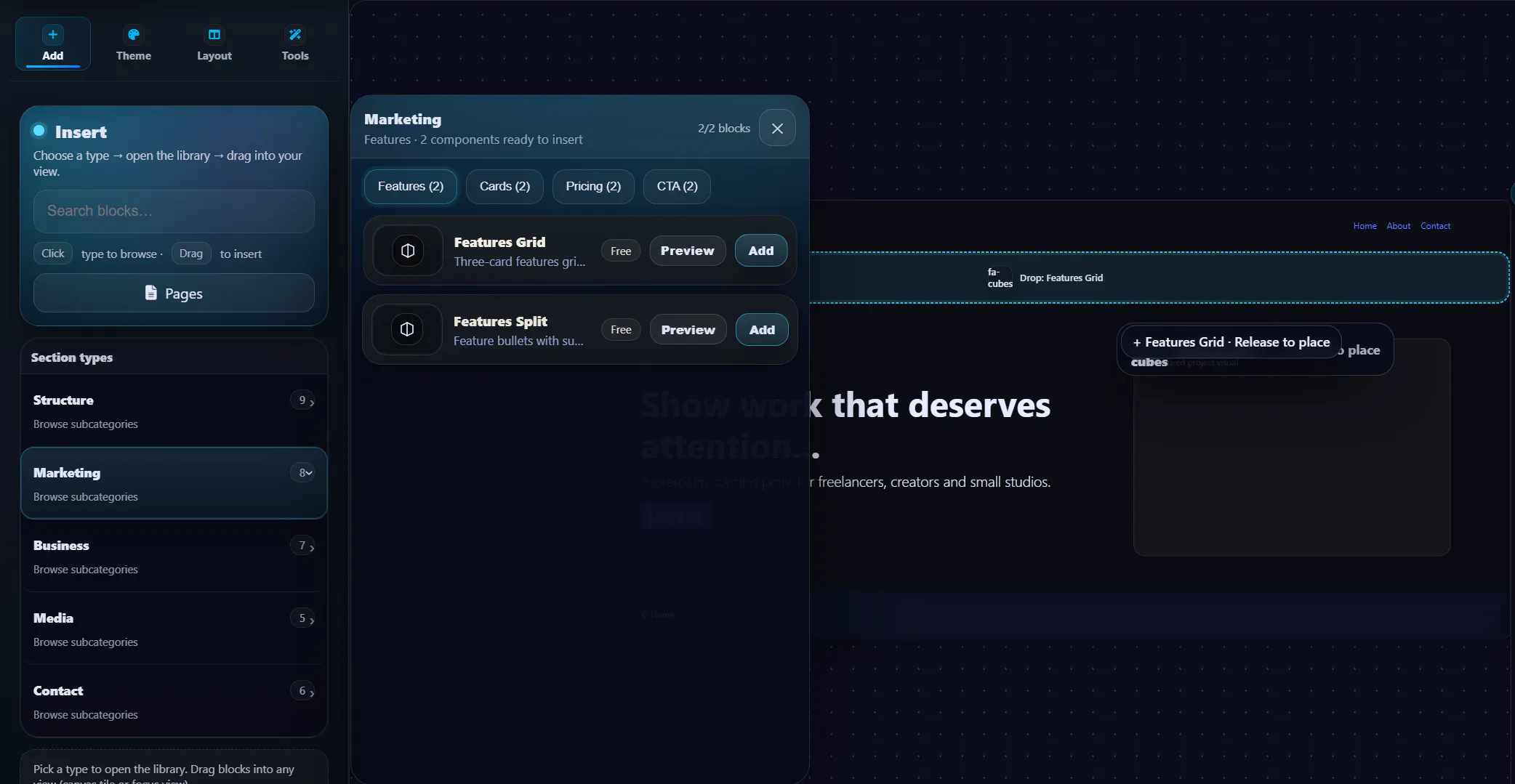
Current work in progress:
We’re testing a more visible drop-slot with labels, edge indicators, stronger container highlights, and clearer placement states like:
Before
After
Inside column
Inside card
New column
Add to page
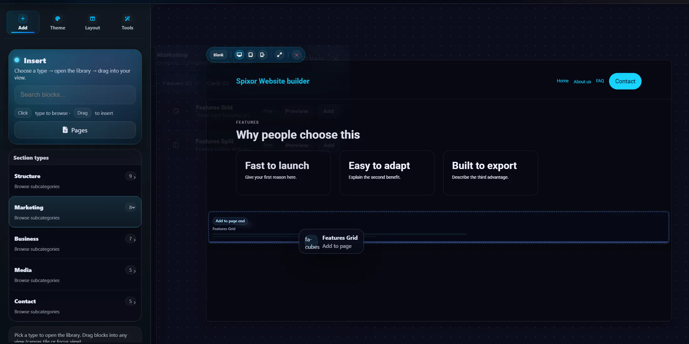
As you can see, we are working on a way to make it more visible and logical how placements works and give you a more visual placement idea. In addition to this, we are also adding the option to have a more flexible placement for the content you want to add. Previously you would only be able to place the drag & drop between sections. Now you can also post it inside columns and more:
Column placement
One specific challenge is placing content between columns.
If a user drags something between two existing columns, it should not simply fall underneath the whole row. The builder needs to understand that the user is trying to create or insert into the column layout.
So we’re working on making this visually clearer before the user drops anything.
The ideal experience:
Drag between columns → existing columns visually make room → preview shows a new column slot → drop confirms the layout.
Why this matters
A visual builder lives or dies by small interaction details.
If the editor feels unpredictable, users lose trust quickly. Even if the underlying logic is technically correct, the experience still feels wrong if the preview is unclear or the mouse position does not feel aligned with the canvas.
So our current focus is making Drag & Drop feel more natural, more visual, and more trustworthy.
What we’re still exploring
Some things we’re still refining:
snap behavior around sections, blocks, and columns
visual spacing when inserting new columns
drag-to-cancel behavior
moving existing content inside the canvas
better animation when layouts shift
clearer previews for nested containers
This is not a finished feature showcase yet. It’s more of a progress update while we continue shaping the builder.
We are curious to hear from other builders, designers, and no-code users:
What makes Drag & Drop feel good to you in a visual editor?
Is it snapping, animated spacing, clear labels, live previews, cancel zones, or something else?
Replies
Be the first to reply
Have a question or a thought to share? Add a comment above to start the conversation.