

Green Robot AI launches Wednesday! 🌞 Last minute branding advice?
Hello everybody! 👋 I'm Stuart, it's nice to meet you.
Green Robot is an AI routing service that saves energy. I will not give you the speech, but you can read all the details at the launch page or my landing page.
I am having second thoughts about the branding though. Would appreciate an extra set of eyes, because I've been looking at this for too long! If you have a moment, please pass judgement, there is still time before launch for changes.
Full disclosure first: there is no actual robot, of any color. The name is a metaphor for something along the lines of "eco-friendly AI". But some people will be disappointed if they go to a place named Green Robot and don't get a robot, and... ok, fair enough. So I tried to make a friendly looking mascot.
Turns out it's really hard to make a robot that's literally green look cool. I tried, but it always came off weird somehow, like alien. Sickly. The closest I could get was this standard white robot with green trim:
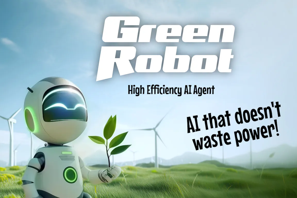
To make the robot more green I put it in a wind farm, and then gave it a seedling to plant. Even so, this feels like a hard sell. The robot is clearly white. The green trim is fooling nobody.
Am I overthinking this?
These days landing pages look something like:
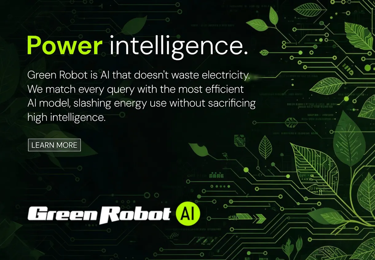
No cognitive dissonance here, but also no metaphor. This is a more respectable sort of look for the tech crowd though.
Gut check? If you have an opinion I am all ears!
Thank you,
-Stuart
Replies