

The one landing page section people mention when they sign up: “see it before it ships”

We launch a feature here on Thursday, and the landing page section for it is the one new users keep bringing up on calls and in replies, more than the hero, more than pricing.
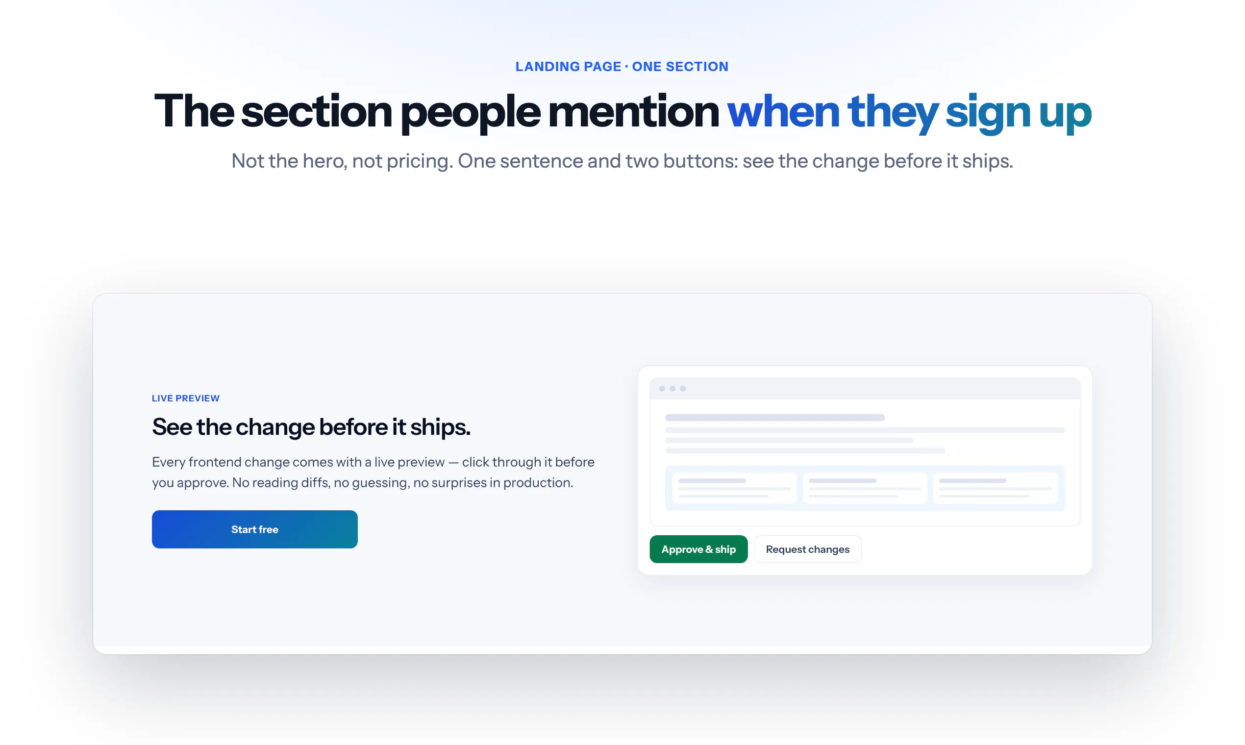
It is a simple block. One sentence: see the change before it ships. One picture of a working copy of your site with the change on it, and two buttons: approve, or send it back.
I think it works because it answers the question people actually have about any tool that writes code for them: what if it gets it wrong? The answer is not “trust us”, it is “look at it first”. The other sections explain what it does. This one removes the fear.
Curious what the equivalent section is on your landing page: the one that answers the fear rather than describing the feature. And for those who have run the test, did it convert better than the feature description?
Replies
This made me rethink my own landing. My pricing section explains cost. It does not explain what if it does not work. Need to fix that.