

glancecard 0.3.0 — your year, as a chart

Your year on GitHub, drawn as a line 📈
Up to 0.2.0, both cards showed the last year the way GitHub does, as a calendar of squares. The squares are great at telling you which days you showed up. They're not great at telling you how much.
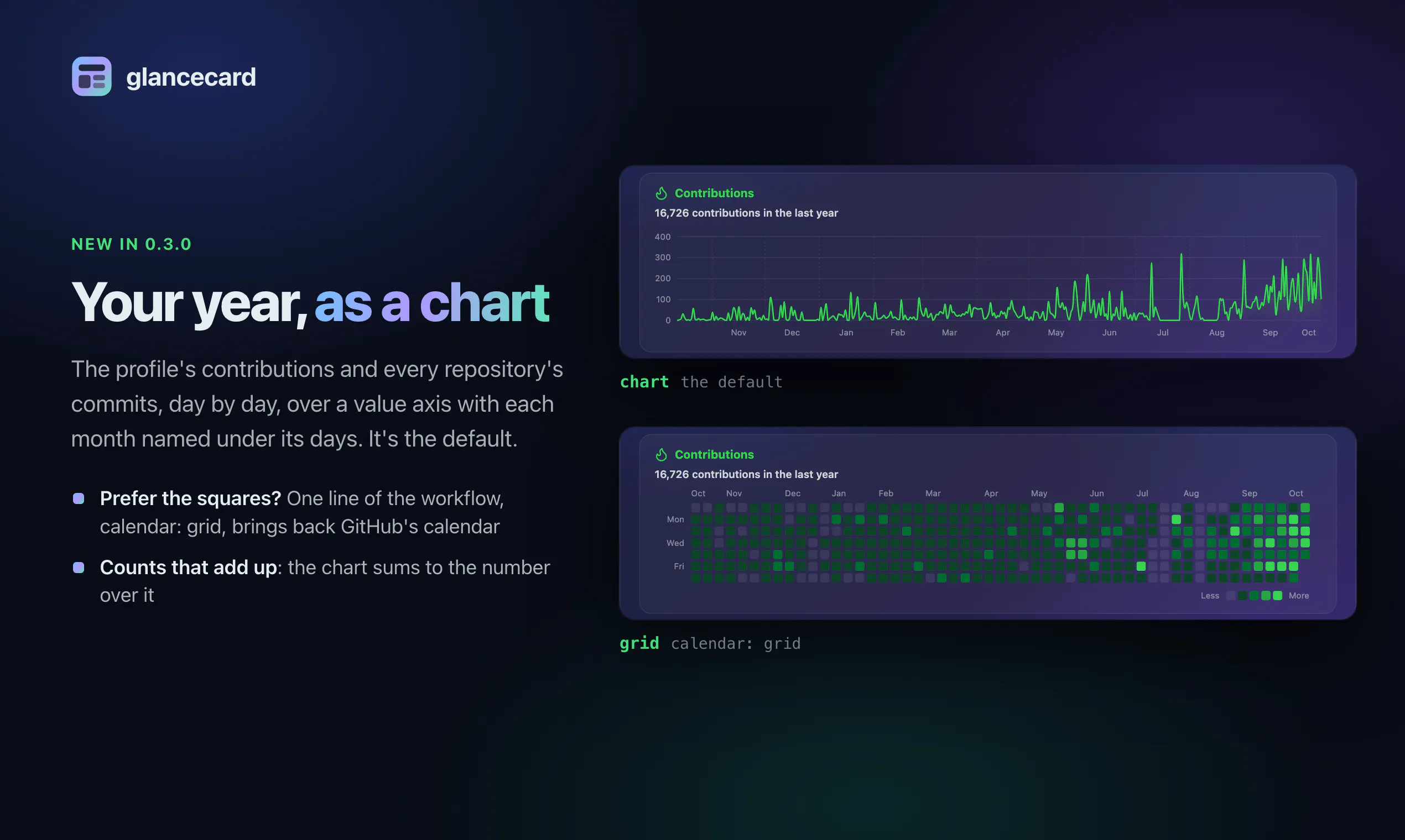
In 0.3.0 the profile card's contributions and every repository card's year of commits are a smooth line of daily counts, over a value axis with a rule at every round step and each month named under its days. The panels keep their height, so a README with a card in it doesn't move.
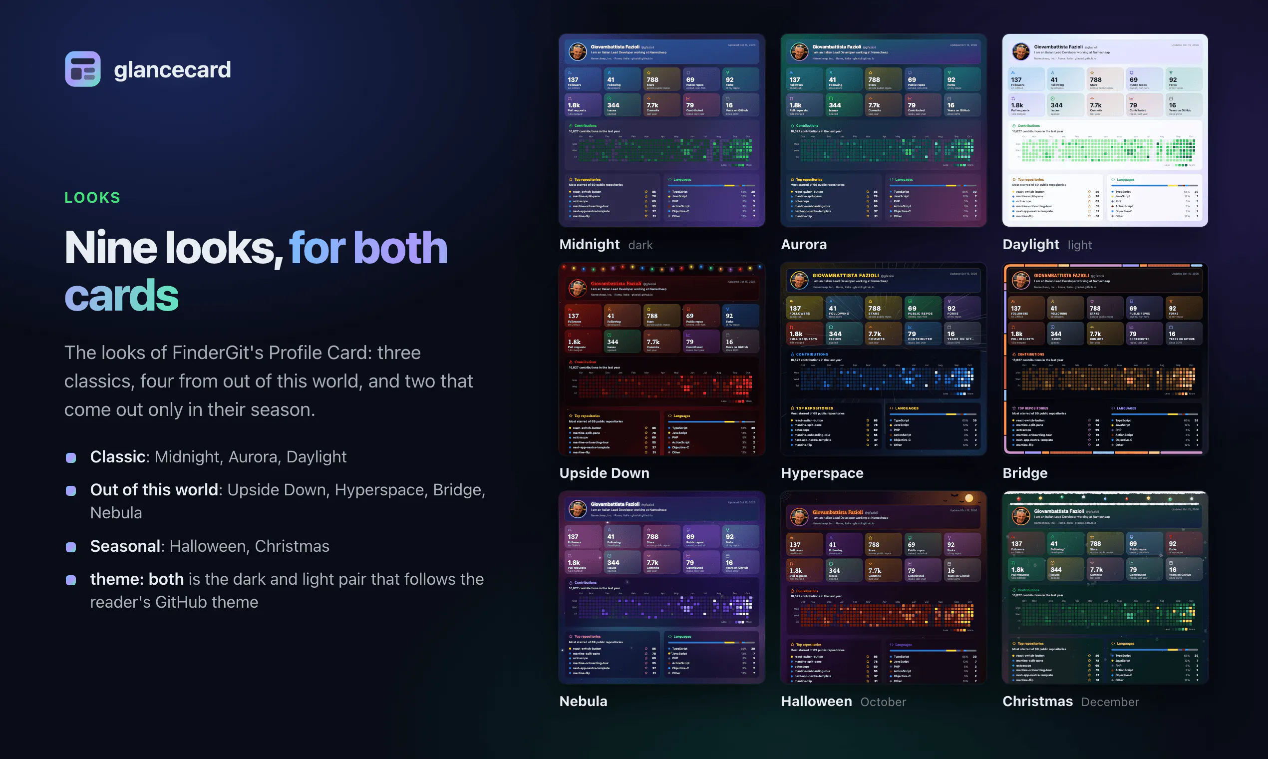
It's the new default. Prefer the squares? No hard feelings, one input brings GitHub's calendar back, unchanged:
- uses: gfazioli/glancecard@v0.3.0
  with:
    profile: your-login
    calendar: grid
From a terminal it's --calendar grid.
The part I enjoyed getting right: the squares only ever needed each day's shade, so that's all the profile card used to ask GitHub for. A line needs the number. 0.3.0 reads each day's actual contribution count, and the days now add up to the total printed above them.
Tip: a typo in calendar stops the run before a single request, the way an unknown time zone does, so it fails loudly instead of drawing the wrong thing.
Upgrade: move the uses: line to @v0.3.0, or merge the pull request Dependabot opens for it.
Chart or squares: which one reads better to you? 👇
Website: https://gfazioli.github.io/glancecard/
GitHub: https://github.com/gfazioli/glancecard
Discord: https://discord.gg/rdWu5yFCR6
Replies
Be the first to reply
Have a question or a thought to share? Add a comment above to start the conversation.