

How we designed FXContext’s broker comparison tool
A broker comparison starts with a deceptively simple question: what exactly are we comparing?
A brand name alone is not enough. The legal entity behind an account, the applicable jurisdiction and the documented trading conditions all matter.
With FXContext, we organised our comparison tool around three principles.
1. Put context next to the information
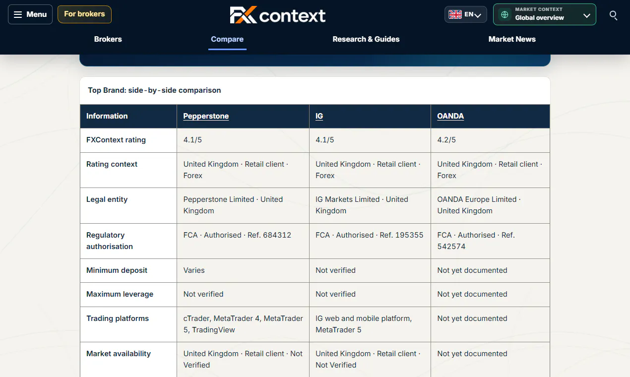
A rating or account term needs context. The comparison shows the relevant legal entity and regulatory authorisation alongside the available broker information, rather than treating a brand as one universal offer.
2. Make missing information visible
An empty field can mean several things: unavailable, not applicable or not yet verified. We use explicit labels such as “Not verified” and “Not yet documented” instead of filling gaps with assumptions.
This also makes the limitations of our current research visible. The comparison is a work in progress, not a claim that every detail has been checked.
3. Keep comparison separate from recommendation
Users can compare up to three broker profiles side by side. A published rating is not required for a profile to be compared.
The aim is to help people examine documented differences—not to declare one broker the right choice for everyone. Ratings should be read together with their scope and methodology.
The current comparison includes legal entities, regulatory authorisations, available account information, trading platforms, review dates and public sources.
Try it here:
https://fxcontext.com/compare/
We’d appreciate feedback on the information layout: which details should appear first, and how could we make missing or unverified information clearer?
Replies
Be the first to reply
Have a question or a thought to share? Add a comment above to start the conversation.