

Most startups are making this UI mistake
by•
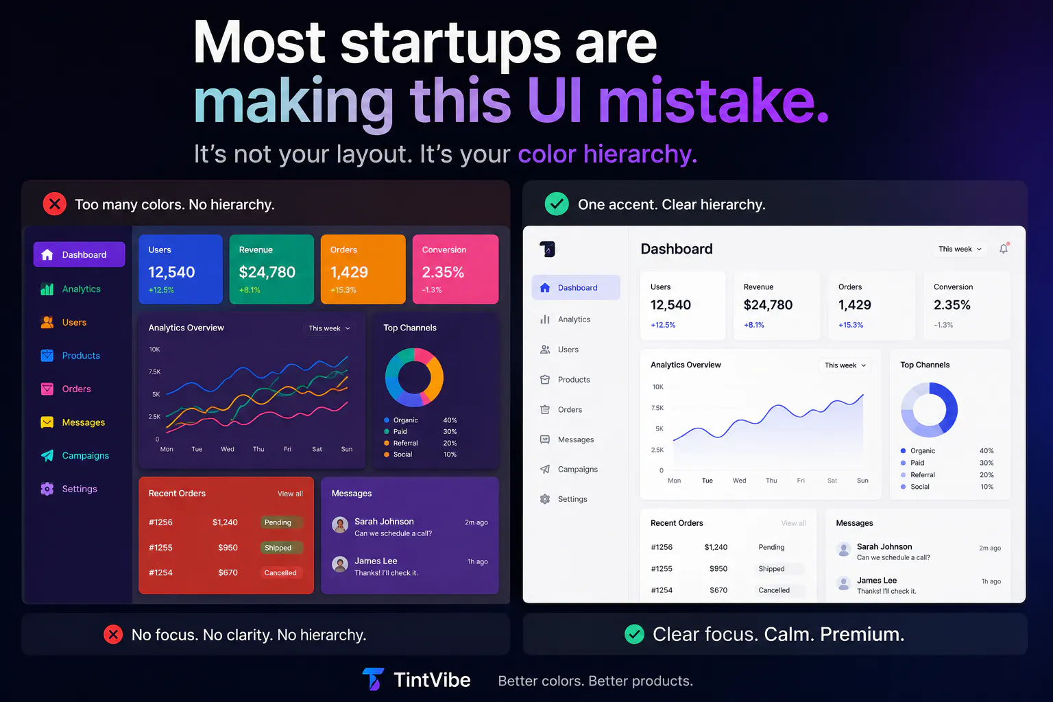
Most UI problems are not layout problems.
They’re color hierarchy problems.
Too many products use:
❌ multiple accent colors
❌ harsh contrast
❌ visual noise
❌ inconsistent states
The result?
Interfaces that feel “busy” instead of premium.
The best products feel calm because every color has a purpose.
Curious:
What’s the biggest UI mistake you see modern startups making today?
8 views
Replies