

Why do premium note apps look so sterile? We built an editorial alternative (70% Launch Loot inside)
Hey Product Hunt! 👋
Let’s be honest: Most default note-taking apps feel like filling out a corporate spreadsheet. They are clinical, sterile, and completely kill the creative flow.
As a developer who writes daily, I wanted a digital workspace that felt like opening a high-end, heavy-paper physical magazine. So we built NOTEPAD.
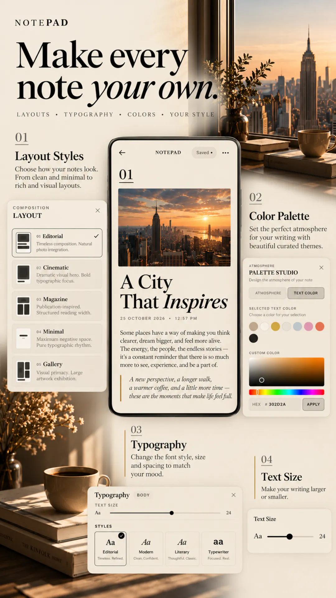
Instead of basic text fields, we brought professional editorial layouts to mobile:
• 5 Curated Compositions – Switch instantly between Editorial, Cinematic, Magazine, Minimal, and Gallery frameworks.
• 16 Curated Typography Styles – Perfect pairing of fonts to match the exact mood of your ideas.
• Photo-Integrated Canvas – Seamless spacing that treats your photographs and text as art, not data.
• 0% Tracking, 100% Privacy – No third-party analytics, no ads, no cloud snooping.
We planned to retail this premium setup at ₹500. But to get it into the hands of the Product Hunt community and build early momentum, we slashed it by 70% down to just ₹149 for launch week.
👉 Grab the Launch Deal on Google Play: https://play.google.com/store/apps/details?id=com.chronelle.notepad
If you appreciate premium typography and clean visual spaces, I'd love to know: Which of our 5 design layouts looks best for your workflow? Let me know in the comments!
Replies
Be the first to reply
Have a question or a thought to share? Add a comment above to start the conversation.