

FramerLaunch websites with enterprise needs at startup speeds.
Tableau Launches

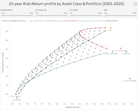
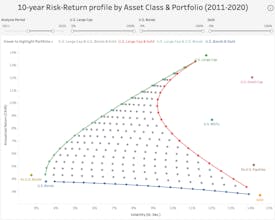
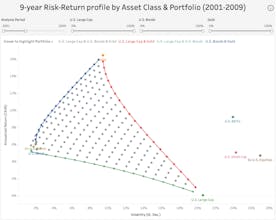
25Y Asset/Portfolio Risk-Return ProfileAdding 2-3 asset classes reduces portfolio volatility
Launched on February 19th, 2026

Analysis of the House M.D. SoundtrackСlick 'Listen' to play the track via Spotify or YouTube.
Launched on January 3rd, 2026

Describe Artists With EmojiVisualize the relation between artists and emojis.
Launched on May 2nd, 2017

