Freelancers lose money on scope creep because they hesitate in the moment. ScopeOrNope gives you a structured answer fast. Submit a client's change request. Get a classification: In Scope, Out of Scope, or Unclear. Get a ready-to-send response in the tone you choose: friendly, firm, concise. Track revision rounds against your limits. See scope risk across all active projects. Override the classifier when your judgment says otherwise. AI classification and response refinement on Pro.
No reviews yetBe the first to leave a review for ScopeOrNope
Maker
📌
I got burnt out on work I used to love. That's why I built ScopeOrNope.
For years, whenever a client asked for "one more thing," I said yes. Every time. I wanted to look good. I wanted to be the person who never made things difficult. So I absorbed the extra work, smiled through it, and told myself it was fine.
It wasn't fine. I was burnt out from working for free, over and over, because I didn't have a way to say no that felt professional instead of difficult. Project after project, something drained out of me. Work I loved started feeling like a grind.
ScopeOrNope is what I wish I'd had.
Paste in a client's change request. Get a classification: In Scope, Out of Scope, or Unclear. Get a draft response you can actually send — in your tone, not a legal robot's. The classifier works against your actual project scope. Every decision is logged. Override it whenever your judgment says to.
A few things worth knowing:
Rule-based classifier runs instantly, no API call needed for most requests. Tone options: friendly, firm, concise, detailed, client-preserving. Full revision tracking with a progress bar. Dashboard scope risk panel across all active projects. Pro adds AI classification, response refinement, and scope gap detection.
Solo founder. Next.js, Supabase, Anthropic's API for Pro.
If it saves one freelancer from burning out on something they love, it's worth it.
I'll be in the comments.
Report
🧐 Good find
@alexander_barkus Love the concept and the story behind it, the burnout angle is real, and the positioning is sharp.
A few things worth fixing as you grow:
1. Your Product Hunt link isn't working; you may be losing signups you don't know about. Worth checking urgently.
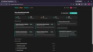
2. The dashboard stat bar shows all zeros on first load. It makes the product feel empty before users have done anything. Hide those stats until there's real data, or replace the whole bar with a single guided action.
3. The project detail page has too many panels open at once: scope, deliverables, revisions, change requests, and excluded work all compete for attention. New users genuinely don't know where to start.
4. The change request result screen is the most cluttered part. Classification result, tone picker, response editor, AI second opinion, and override panel are all visible at the same time. The core job verdict copy response gets buried.
5. AI second opinion being open by default subtly undermines confidence in your main classifier. It should be a secondary tap, not a default open panel.
6. The override section always being expanded implies the result is probably wrong. Tuck it behind a small disagree?link instead.
The logic and the features are solid. The gap is progressive disclosure: show the answer, then one action, and hide everything else until the user asks for it. That's what will get people to their aha moment faster.
Had trouble finding a contact, reach me at olayanjuidris@ gmail.com
Report
Maker
@olayanju_idris Thank you so much for this feedback! I'm going to start by reviewing the priorities on this list and adding them to the development plan. Thanks so much for checking this out, and I really appreciate the time you took to explore and add projects. This kind of insight is what I miss when being the only one staring at it day by day. Also, I made sure to update that link IMMEDIATELY. You are the best!




@alexander_barkus Love the concept and the story behind it, the burnout angle is real, and the positioning is sharp.
A few things worth fixing as you grow:
1. Your Product Hunt link isn't working; you may be losing signups you don't know about. Worth checking urgently.
2. The dashboard stat bar shows all zeros on first load. It makes the product feel empty before users have done anything. Hide those stats until there's real data, or replace the whole bar with a single guided action.
3. The project detail page has too many panels open at once: scope, deliverables, revisions, change requests, and excluded work all compete for attention. New users genuinely don't know where to start.
4. The change request result screen is the most cluttered part. Classification result, tone picker, response editor, AI second opinion, and override panel are all visible at the same time. The core job verdict copy response gets buried.
5. AI second opinion being open by default subtly undermines confidence in your main classifier. It should be a secondary tap, not a default open panel.
6. The override section always being expanded implies the result is probably wrong. Tuck it behind a small disagree?link instead.
The logic and the features are solid. The gap is progressive disclosure: show the answer, then one action, and hide everything else until the user asks for it. That's what will get people to their aha moment faster.
Had trouble finding a contact, reach me at olayanjuidris@ gmail.com
@olayanju_idris Thank you so much for this feedback! I'm going to start by reviewing the priorities on this list and adding them to the development plan. Thanks so much for checking this out, and I really appreciate the time you took to explore and add projects. This kind of insight is what I miss when being the only one staring at it day by day. Also, I made sure to update that link IMMEDIATELY. You are the best!