
Databox is an AI-powered business intelligence and analytics platform for teams that need clear, trusted answers fast. It offers the best of BI, without the complicated setup, steep price, or long learning curve. It provides a blend of powerful, but easy-to-use, features, from preparing datasets and creating the custom metrics your company needs to track, to building beautiful dashboards, customizing your reporting, and receiving AI-powered insights.
This is the 9th launch from Databox. View more
Routines by Databox
Launched this week
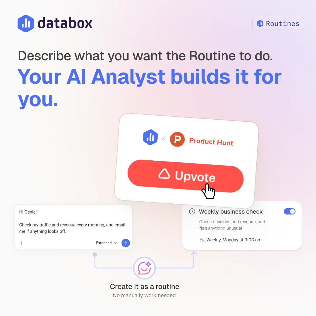
Give your AI Analyst a prompt and a schedule. It analyzes your live data, prepares the report or analysis you asked for, and delivers it by email, Slack, or in-app. The recurring work you do by hand today gets done automatically.


Free Options
Launch Team / Built With



Skills + Routines are my new best friends. As a product person, I have to do a lot of analysis and a Skill helps me define how I want the analysis done and with a Routine I can make it into a daily workflow in a single step. No more clicking through another round of setup.
Databox
@mateja_verlic_bruncic Love hearing that combo click for you. A Skill defines how you want the analysis done, a Routine makes it run without you lifting a finger again, that's exactly the loop we built. What's the first thing you turned into a Skill?
Databox
I'd like to point to 2 details:
- this allows you to turn any existing chat or artifact into a Routine with one click, which means no rewriting instructions or prompts
- every Routine run is saved and searchable, so digging up 'what did last Tuesday's check say' doesn't mean scrolling back through chat history
It's small things like these two that make this feature super useful.
Databox
I really like is how easy creating a routine is.
You can ask Genie in plain English (or your own language) and it works out the instructions for you. Or you can go to an existing chat or Artifact and turn it into a routine with a single click.
Either way, you end up in the same place: taking something you already wanted to do and making it run on its own on a fixed schedule. No rewriting and rebuilding prompts, no setting up everything up from scratch every time you wand an analysis report or just a simple answer to a recurring question.
Databox
One comparison I think is cool here is Databox Routine vs cron job. A cron job just runs a script on a timer, doesn't do any reasoning and just gives you the same type of analysis every time. A Routine decides each time what is worth focusing on and telling you. It's a different analysis every time. Sounds like a small thing, but is why I trust it to run analysis autonomously instead of me doing it manually myself.
I set up my routine for paid ads instead of building the weekly monitoring report by hand every Monday or manually checking my dashboards every day. Ask once, 'summarize performance every day at 9am and it's already in Slack when I need it. Built from the same connected data as my dashboard, so there's nothing to double check before sending it along. Literally took me a few mins and I just pointed ai analyst to the right dashboard.
EverTutor AI
This is actually a really smart use of AI. Set it once and let it keep doing the analysis for you. Congrats on the launch, @zigapotocnik
Databox
@suryansh_tiwari2 Thanks Suryansh! Set it once and forget it is exactly the goal, no reason a person should be the one re-running the same question every week.
I tested routines before and set one up to use a skill and automatically prepare a MTD sales pipeline overview artifact that analyzed open deals and suggested next steps. This is a game changer for how quickly I'm able to define next steps!