

We split one gold risk check into four tools. Was that the right UX call?
While building the XAUUSD tools behind TR-MATE, we ran into a product-design question.
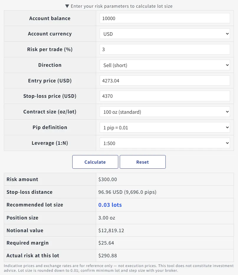
It would have been easy to make one large “gold trade calculator.” But that can blur four different checks:
• margin required to open the position
• P/L if price moves
• lot size for a defined risk and stop-loss
• overnight swap if the position is held
We chose to split them into separate tools. The trade-off is an extra click, but each result has a clearer input and purpose. A lot-size result, for example, should not look like a prediction or a recommendation to trade.
For builders who have designed financial, health, legal, or other high-consequence interfaces: would you prefer one guided workflow, or separate tools with sharper boundaries? What would make the split feel clearer rather than fragmented?
Replies