

Should a gold research dashboard include companion tools or stay focused?
Hi Product Hunt!
I’m building Gold Dashboard at TR-MATE Global, a research-first interface for exploring XAUUSD price data, multi-timeframe charts, gold news, observed support and resistance levels, and market context.
One product-design question I’m working through is how a focused dashboard should connect to related tools without becoming too dense.
The current interface keeps two jobs separate:
1. Gold Dashboard helps answer: “What is happening in the gold market?”
It brings the chart, news, observed levels, timeline, and market analysis into one research view.
2. XAUUSD Spread Comparison helps answer: “How do account-level spread, round-trip commission, and cost per lot compare?”
It is a separate comparison page linked from the dashboard’s Gold Trading Resources section.
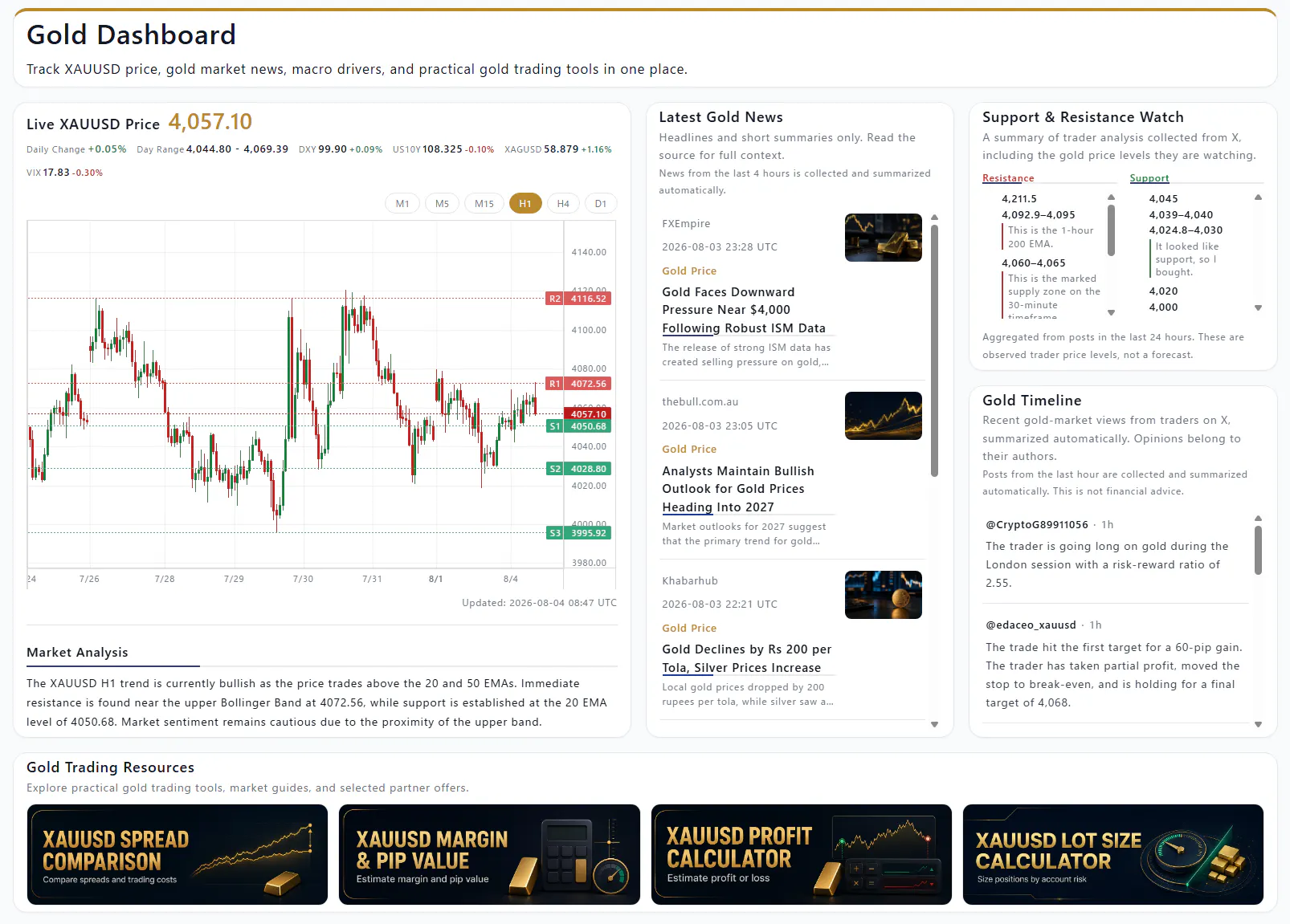
The goal is not to turn every tool into another dashboard card. The two pages use different data models and support different user tasks, so keeping them separate makes the navigation and meaning clearer:
• market context stays focused in Gold Dashboard
• account-cost comparison stays focused in XAUUSD Spread Comparison
• users can move from research context to cost comparison when they need it
• neither page has to pretend to be a trading signal or investment recommendation
Current pages:
Gold Dashboard:
https://copi-tools.com/gold-dashboard/
XAUUSD Spread Comparison:
https://copi-tools.com/blog/xauusd-spread-comparison/
I’d love feedback from makers who build products with related tools:
• Do you prefer companion tools to appear as resource cards, tabs, or separate products?
• When does linking to a related tool improve the workflow, and when does it feel like distraction?
• What would you expect to find next to a gold-market research dashboard: cost comparison, calculators, historical data, or something else?
I’m interested in information architecture and product discovery—not trading predictions or financial advice.
Replies