

8 App Store screenshots → 17 screens, 58 named components
Everyone starts a product by pointing at another app. "Make it like this one."
And then you're holding a PNG. You can look at it. You can't touch it.
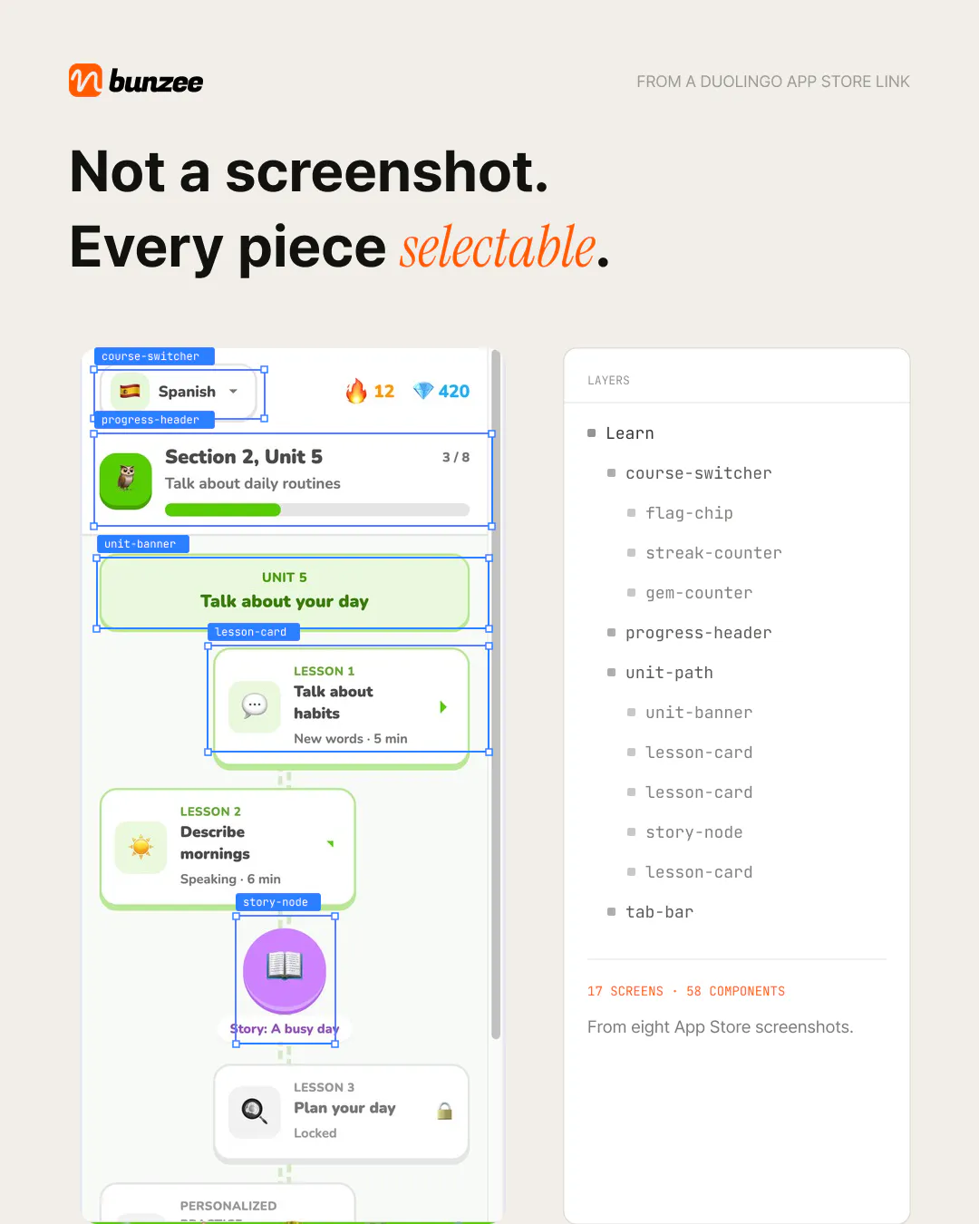
We're testing a feature that takes the App Store link instead of the screenshot. Here's a Duolingo run:
In: 8 store screenshots Out: 17 screens, 58 components every one named and selectable. course-switcher, streak-counter, lesson-card, story-node, tab-bar.
The naming is the part I actually care about. A flat image gives you pixels. A named layer tree gives you something an AI coding tool can reason about and something that can land in Figma as real nodes, which is the plugin we're working on next.
Two things we got wrong on the first pass:
We chased pixel-perfect. Wrong goal. Nobody wants a clone of someone else's app. Structure comes from the reference, visuals come from your own style guide keeping those separate made the output usable instead of uncomfortable.
We assumed store screenshots were screens. They aren't. They're marketing crops annotated, rearranged, sometimes composited from screens that don't exist in the app. A good chunk of the work is undoing the marketing before you can read the product underneath.
Still in testing. If there's an app you keep pointing at as "like this," drop it in the comments and I'll run it and post the output here.
Real question though: when you use a reference app today, what's your step 2 after the screenshot? I'm not convinced most people have one.
Replies
Be the first to reply
Have a question or a thought to share? Add a comment above to start the conversation.