TimeTurtle

Clutter-free time tracking based on an interactive timeline

2 followers

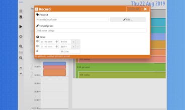
TimeTurtle 🐢 is a time tracker with minimal clutter that is based on a linear timeline. It has an interactive user experience, allowing you to see directly what you’ve spent your time on.
TimeTurtle gallery image
Launch Team
Auth0
Auth0
Start building with Auth0 for AI Agents, now generally available.
Promoted

What do you think? …

Almar Klein
Hi! This is Almar from The Netherlands. TimeTurtle is my first product, and I’m excited to launch it here today! Working as a freelancer, I've never been happy with existing time trackers. I found they often had too many features, and therefore failed to do the one thing well. I always felt that the UX missed the notion of time being linear. Last year I decided to have a serious go myself, using my experience with visualization and user interaction to create something unique. Well, hopefully unique enough to stand out among the many other time trackers 😊 Any feedback, advice or comments are much appreciated! 🙏 Thanks! PS: Apply the PRODUCTHUNT coupon at checkout to receive a 33% discount on the Pro plan (valid until the end of August). ✨
Mike Dane
I think there is a room for improvement in its design. It could be refined more.
Almar Klein
Hi @mikedane7, thanks for trying out and giving feedback! Yeah, design is not my strong suit 🙂 Do you have some specifics that I can work on?
Ashley H
I like the idea of it, it's easy to use, I wish the icons were improved to look a little more modern or make it more purposefully stylized. I think you should move the date along the vertical column a little more to the left as it feels too close to the schedule. It feels like it will almost touch or will overlap and could become hard to read. I don't think you really need that info though and keeping it in the top seems fine. I wish you had a few more labels or maybe hover states. What does clicking on my initials do? Does it just refresh? I would have expected account info when clicking on my initials though to be far it doesn't look like a button. I know it's out of scope but a calendar view would be cool. I think you should repeat the background pattern on the colored time block for more visual interest or something, maybe just adding a clock icon pattern or something. If I had more time I'd offer a design mock-up of some small improvements but I'm pretty busy.
Almar Klein
Hi @softsound, these are all very valuable suggestions. Thanks for taking the time to write them up! I've noted your points for the next re-design.
Almar Klein
Somehow the Youtube link got lost, and I can't see how to update it, so here it is: https://youtu.be/3F0vCWz7804
Rayan Smith
Looks nice and clean enough. Will try it out.