The conference review site built for attendees, not organizers. Because the best advice on where to spend your time and money comes from someone who already did.
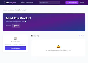
No reviews yetBe the first to leave a review for The Lanyard
Maker
📌
I built The Lanyard because I kept making expensive conference mistakes.
After years of attending professional conferences, I realized there was no trustworthy place to find out if an event was actually worth the time and money. Review sites either didn't exist for this category or were effectively controlled by the people running the events.
So I built one. With very limited software engineering background, a lot of curiosity, AI-assisted development, and a belief that the community deserves an honest resource.
The Lanyard is community-driven, conflict-free, and built for attendees first. No organizer can buy a better rating. No sponsor controls the narrative. Just real reviews from people who were actually in the room.
Would love your feedback. If you've ever left a conference wondering why you went, you're exactly who this is for.
Report
Hey,
Came across The Lanyard — genuinely strong idea. The positioning is clear, the problem is real, and the “attendee-first, conflict-free” angle has serious potential. This could become a trusted layer in a space that currently lacks one.
I went through the product and noted a few UX issues that are likely hurting trust, retention, and conversion:
Visual direction (colors) The current purple gradient feels дешево and шаблонно. It gives off a “generic AI startup” vibe rather than a trustworthy, signal-rich platform. For a product built on credibility, the visual layer should feel calmer, sharper, more editorial.
Emoji overuse Heavy emoji usage makes the interface look less serious and slightly chaotic. This pattern is everywhere right now (mostly because AI-generated products default to it), but in practice it reduces perceived quality. Replacing them with a consistent icon system would immediately elevate the product.
Mobile layout (homepage) The mobile experience feels poorly structured — hierarchy is unclear, and key actions don’t naturally guide the user. This is especially critical since a large share of users will discover and browse on mobile.
Interaction issue (reviews click area) Reviews are technically clickable, but only a small, non-obvious part of the card responds to interaction. The rest of the card feels interactive but does nothing, which breaks user expectations. Users naturally assume the entire review block is clickable — aligning the interaction area with that expectation would make the experience feel much smoother and more intuitive.
Review quality structure Right now many “reviews” are just ratings with no context. That weakens trust. It would be much stronger to separate:
full, detailed reviews
quick ratings (clearly labeled as such)
This creates a perception of depth instead of randomness.
Overall: the core idea is genuinely compelling. With tighter UX, stronger visual identity, and a few structural fixes, this could feel like a high-trust, must-use platform rather than “another early-stage tool.”
If you're open to it, I’d be happy to go deeper and help refine this properly.
Best, Nick
P.S. I run focused UX audits for early-stage products — not just surface-level feedback, but deep dives into where exactly you’re losing trust, clarity, and conversion, with concrete fixes you can implement fast.
If you’re aiming to turn The Lanyard into a truly high-trust product (which it has the potential to be), I’m confident I can help tighten the experience to that level. Happy to walk you through what that would look like and see if it makes sense to work together.
Report
Maker
@televizor_account I appreciate the feedback. I need to process it more, but wanted to acknowledge I read your comments.



Hey,
Came across The Lanyard — genuinely strong idea. The positioning is clear, the problem is real, and the “attendee-first, conflict-free” angle has serious potential. This could become a trusted layer in a space that currently lacks one.
I went through the product and noted a few UX issues that are likely hurting trust, retention, and conversion:
Visual direction (colors)
The current purple gradient feels дешево and шаблонно. It gives off a “generic AI startup” vibe rather than a trustworthy, signal-rich platform. For a product built on credibility, the visual layer should feel calmer, sharper, more editorial.
Emoji overuse
Heavy emoji usage makes the interface look less serious and slightly chaotic. This pattern is everywhere right now (mostly because AI-generated products default to it), but in practice it reduces perceived quality. Replacing them with a consistent icon system would immediately elevate the product.
Mobile layout (homepage)
The mobile experience feels poorly structured — hierarchy is unclear, and key actions don’t naturally guide the user. This is especially critical since a large share of users will discover and browse on mobile.
Interaction issue (reviews click area)
Reviews are technically clickable, but only a small, non-obvious part of the card responds to interaction. The rest of the card feels interactive but does nothing, which breaks user expectations. Users naturally assume the entire review block is clickable — aligning the interaction area with that expectation would make the experience feel much smoother and more intuitive.
Review quality structure
Right now many “reviews” are just ratings with no context. That weakens trust.
It would be much stronger to separate:
full, detailed reviews
quick ratings (clearly labeled as such)
This creates a perception of depth instead of randomness.
Overall: the core idea is genuinely compelling. With tighter UX, stronger visual identity, and a few structural fixes, this could feel like a high-trust, must-use platform rather than “another early-stage tool.”
If you're open to it, I’d be happy to go deeper and help refine this properly.
Best, Nick
P.S. I run focused UX audits for early-stage products — not just surface-level feedback, but deep dives into where exactly you’re losing trust, clarity, and conversion, with concrete fixes you can implement fast.
If you’re aiming to turn The Lanyard into a truly high-trust product (which it has the potential to be), I’m confident I can help tighten the experience to that level. Happy to walk you through what that would look like and see if it makes sense to work together.
@televizor_account I appreciate the feedback. I need to process it more, but wanted to acknowledge I read your comments.