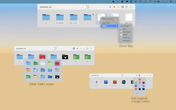
Kickfolder lives silently at the top of your screen. Hover near the notch, and your most-used files, folders, and apps instantly slide down — no Finder digging, no desktop clutter. ✦ Hover to reveal — zero clicks needed ✦ Drag & drop to register files instantly ✦ ⌘ key to move instead of copy ✦ Color-coded pages for project organization ✦ Full Dark Mode + multi-Space support ✦ Zero data collected — ever Your Mac's notch finally does something useful.
Hey Product Hunt!
I built Kickfolder because I kept losing time every time I needed a file.
The workflow was always the same: ⌘+Tab → open Finder → dig through folders → grab the file. Over and over.
Then I looked at the notch on my MacBook and thought — this space is just sitting there doing nothing.
So I turned it into a smart shelf. Hover at the top of your screen, and everything you need slides down instantly. No clicks, no Finder, no clutter.
It's my first Mac app, and I'd love to hear your honest feedback — what works, what's missing, what you'd change.
Thanks for checking it out!
Report
Most launcher tools add another place to look. Kickfolder does the opposite. Turning the notch into an always ready command center means your files are already where you need them before you think to reach for them. That's a different interaction model, not just a shortcut.
The zero click reveal and drag and drop registration make the whole thing feel anticipatory rather than reactive. And that feeling is exactly what separates tools people use from tools people rely on.
The positioning angle worth leaning into: an invisible layer lands better than a launcher or productivity tool. It describes an outcome, working smarter without thinking about it, rather than a feature. For Mac power users, that framing tends to click fast because it names something they already want but couldn't articulate.
Curious whether the notch eventually becomes a hub for everything you touch daily, not just files.
Finally, a utility that makes the Notch actually useful. The hover interaction feels native and the file management is surprisingly fast. Exactly the kind of tool that should have existed from day one.
What needs improvement
Would love to see keyboard shortcuts for switching between pages, and maybe iCloud Drive support down the line. But for a 1.0, it's remarkably solid.
vs Alternatives
I tried keeping folders in the Dock and using Alfred for quick file access, but neither felt as seamless. Kickfolder lives exactly where your eyes already go — the top of the screen.




Kickfolder
Most launcher tools add another place to look. Kickfolder does the opposite. Turning the notch into an always ready command center means your files are already where you need them before you think to reach for them. That's a different interaction model, not just a shortcut.
The zero click reveal and drag and drop registration make the whole thing feel anticipatory rather than reactive. And that feeling is exactly what separates tools people use from tools people rely on.
The positioning angle worth leaning into: an invisible layer lands better than a launcher or productivity tool. It describes an outcome, working smarter without thinking about it, rather than a feature. For Mac power users, that framing tends to click fast because it names something they already want but couldn't articulate.
Curious whether the notch eventually becomes a hub for everything you touch daily, not just files.