Graphy
The fastest way to visualize and share your data.
4.9•12 reviews•2.4K followers
The fastest way to visualize and share your data.
4.9•12 reviews•2.4K followers
At Graphy we’re on a mission to give everyone data superpowers, our goal is to build the easiest to use and most collaborative data visualization platform on the market.
This is the 5th launch from Graphy. View more

Graphy 3.0
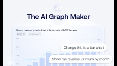
Hate pivot tables? So do we. Graphy is the fastest way to turn messy data into clean, branded, presentation-ready graphs in seconds.


Free Options
Launch Team / Built With


Roamr for Friends
Graphy
@stephen_dooley1 ❤️
Graphy has been a game-changer for how I work with data. The annotation features in 3.0 are particularly powerful. They’ve made it incredibly easy to turn messy, complex datasets into clear, compelling insights.
What really sets Graphy apart is how it allows you to tell a story with your data. With intuitive annotations and smart highlights, you can guide your audience through the “why” behind the numbers - all while maintaining a beautiful, polished look and feel. This combination of narrative clarity and elegant design keeps people hooked from start to finish.
It’s more than just visualization; it’s communication. Graphy 3.0 strikes the perfect balance between clarity and depth. Big thumbs up to the team for this thoughtful update! 👏
Graphy
@joe_edwards6 aww thanks Joe!!!
Graphy
@joe_edwards6 Joe, you're the best customer ❤️
Liveblocks
Congrats on the launch!
Graphy
@stevenfabre thank you so much! ❤️
Graphy
Thanks @stevenfabre
Chronicle
We've been using Graphy at Chronicle for our data viz and couldn't recommend it more. Kudos team!
Graphy
@tejgw Graphy and Chornicle = best combo!
Graphy
@tejgw Awesome! Thanks so much
Beautiful! Curious, what are some hard-earned insights about data storytelling that you’ve built into Graphy?
Graphy
Thanks, Diana!
I’d say one of the biggest insights we’ve built into Graphy is that less is more when it comes to effective data storytelling.
It starts with choosing the right chart. For example, pie charts should rarely have more than 4–5 slices, bars work best under 15–20 bars, etc.
But more importantly, we’ve learned that a good chart doesn’t try to say everything. We help users focus on just one insight per chart, with annotations, comparisons, and difference arrows to guide attention.
Gamma
Amazing product and team! So cool to see this come alive, I think people are going to find this really useful and a huge timesaver.
Graphy
Thanks so much @gslee , we think so too!!!
Graphy
@gslee thank you 🤩
Tool Finder - Find Productivity Tools
Good luck for the rest of the day! :)
Graphy
Thanks!@francescod_ales