

How much information is too much for a focused dashboard?
Hi Product Hunt!
I’m building Gold Dashboard at TR-MATE Global, a research-first XAUUSD dashboard.
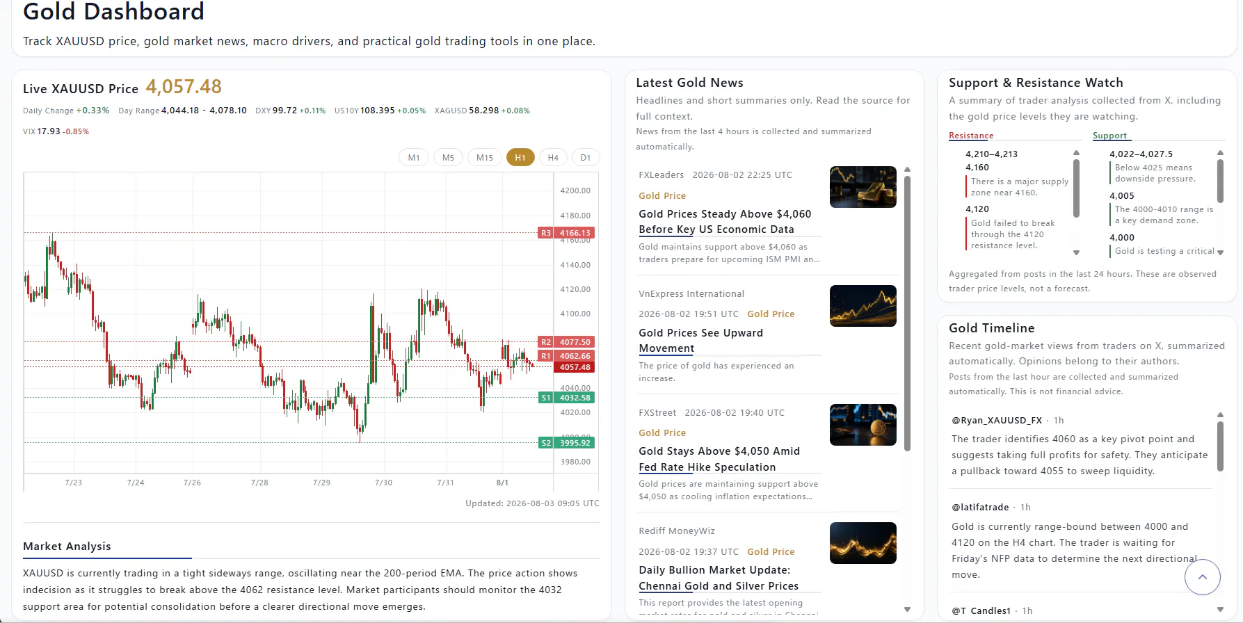
The current first screen combines a price chart, gold news, support and resistance observations, and market analysis. Each section is useful on its own, but putting too much context in one view can make the product feel crowded.
The design question I’m working through is not “What else can I add?” It is “How much should be visible before the interface becomes noise?”
I’m currently exploring a few principles:
• Keep one primary chart as the visual anchor
• Show supporting context without competing with the chart
• Use progressive disclosure for details
• Make timestamps and data status visible without adding visual clutter
• Let users scan the first screen quickly, then go deeper when needed
I’d love feedback from people who design or use data-heavy products:
1. At what point does a dashboard feel crowded, even when every card is useful?
2. Do you prefer all key context visible at once, or one primary view with expandable details?
3. Which interaction makes scanning easier: tabs, accordions, filters, or separate pages?
You can see the current interface here:
https://copi-tools.com/gold-dashboard/
I’m interested in information hierarchy and interaction design—not trading predictions or financial advice.
Replies