Utopia | Fluid responsive design

Utopia | Fluid responsive design

Elegant, intentional and fluid typography and space palettes

0 followers

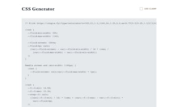
Utopia emerges when designers and developers share a systematic approach to fluidity in responsive design. Instead of designing for x number of arbitrary breakpoints, we can design a system within which elements scale proportionally and fluidly.
Utopia | Fluid responsive design gallery image
Launch Team
Webflow | AI site builder
Start fast. Build right.
Promoted

What do you think? …

Trys Mudford
Hey! I'm one of the creators of Utopia. As a designer/developer pair with years of experience building responsive sites, we regularly found ourselves battling the same issues of arbitrary breakpoints, inconsistent type sizes, and unintentional spacing. Through real client projects, we converged on a fluid type and space system that ensured that the design would always be "in tune" with itself, and fit appropriately on any device. Through intrinsic components, modular scales, and CSS custom properties, this foundational system is designed to help you create consistent, systematic, and harmonious digital interfaces. Utopia isn't a plugin, or a framework, but a way of thinking about fluid responsive design. We've created a few free tools to support your next Utopian projects. There's also a blog, filled with our thinking on the subject. This way of designing won't be for everyone, but if you crave a more systematic approach to your interfaces, and wish to improve communication between design and development functions, Utopia may be just what you're looking for.