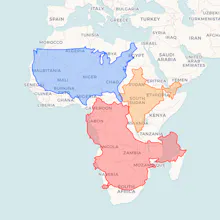
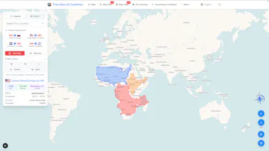
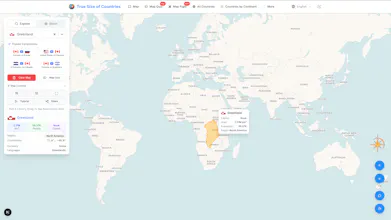
Explore the real size of countries with an interactive map. Drag, compare, and discover how the Mercator projection has misled us for over 200 years. Multilingual, mobile-friendly, and perfect for educators, geography enthusiasts, and curious minds.
No reviews yetBe the first to leave a review for TrueSizeOfCountries.org
Maker
📌
👋 Hi everyone!
We built **[TrueSizeOfCountries.org](https://truesizeofcountries.org/)** because most of us grew up with world maps that quietly distorted reality. The Mercator projection made Greenland look huge and Africa look small — and that changes the way we *see* the world.
This tool lets you drag and drop countries on the globe to compare their *actual* sizes — with a clean, modern, and multilingual experience.
We’d love to hear your thoughts:
* Which country comparisons surprise you the most?
* How do you think distorted maps have shaped our perspective?
Excited to share this project with the PH community 🌍✨