Total Real Returns

Total Real Returns

Inflation-adjusted stock charts

2 followers

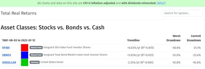
We show wealth preservation and growth more clearly than conventional (nominal-dollar, price-only) stock charts, because we include the effects of inflation-diminished purchasing power, and the effects of reinvesting dividends from the initial investment.
Total Real Returns gallery image
Free
Launch Team
Framer
Framer
Launch websites with enterprise needs at startup speeds.
Promoted

What do you think? …

Mike Robbins
I always found that conventional stock charts were potentially deceptive, since they include neither dividends (which make up a big part of returns!), nor the effects of price inflation over the long run. Here's an attempt to make it better. One potential downside is that it is hard to explain exactly what the y-axis, but I tried on the homepage. Let me know if the "baguettes" story makes sense to you!