Tailwind CSS Viewport Sizer

Tailwind CSS Viewport Sizer

Perfect TailwindCSS Breakpoint Insights 📐

13 followers

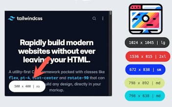
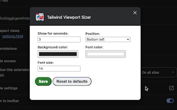
Tailwind Viewport Sizer gives you real-time browser viewport insights, that include TailwindCSS breakpoints. Customize the badge—choose colors, fonts, and visibility length. TailwindCSS developers rejoice with this essential tool. 🚀
Tailwind CSS Viewport Sizer gallery image
Free
Launch Team
Flowstep
Flowstep
Generate real UI in seconds
Promoted

What do you think? …

Martijn Smit
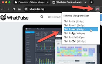
Hi everyone 👋 I'm a big fan of TailwindCSS, and use it for every new project I build. Recently, I've wanted to make it easier to create responsive designs and get a grip on the Tailwind breakpoints (xs, sm, md, etc.) while doing so. There were a few solutions out there, but they either had to be integrated into the app codebase, or if it was a browser extension where I had to remember the width breakpoint size (640px, 768px, etc.), which is a no no. 😉 So, I built a Chrome extension called Tailwind Viewport Sizer! Simple extension that fades in for a few seconds with the exact viewport size and on which Tailwind CSS breakpoint it's on. You can customise the badge that fades in, choosing its background and font color, font size, the browser corner it appears in, and how long you want it to be visible. There's also a popup in the extension icon that'll let you jump to a specific breakpoint for quick resizing. I hope you find this as useful as I do. 😊
Alex Duggleby
@smitmartijn so simple, but so useful. Didn't realize it wouldn't work in full screen mode, but once you put the browser into window mode it works like a charm. Next up please the same for Firefox :)
Martijn Smit
@aduggleby Hah, that's awesome. Yeah, it's specifically for when you're resizing the browser - it'll fire once for when you put your browser into fullscreen, though! 😉