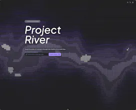
Project River turns raw Git commit data into an interactive streamgraph -- a flowing, color-coded visualization where each band represents one contributor and the thickness shows their activity over time. It's built for engineering managers, tech leads, and open-source maintainers who need to answer questions that GitHub Insights can't: Who are the quiet core contributors? When did a project's momentum shift? Is knowledge concentrated in too few people?
No reviews yetBe the first to leave a review for Project River
Maker
📌
Hey Product Hunt -- I'm Lionad, a web engineer building tools at the intersection of data visualization and developer experience.
I built Project River because I kept running into the same problem: GitHub's built-in insights tell you *what* happened (commit counts, PR velocity), but not *who* the project depends on or *when* its community shifted. I wanted to see the full shape of a repository's history in a single glance.
So I turned Git commit data into streamgraphs -- flowing, color-coded charts where every band is a contributor and the width represents their activity. The result is something you can actually *read*: you can spot when a key maintainer stepped back, see how a project's contributor base diversified after a major release, or identify bus-factor risks before they become emergencies.
The demo has pre-loaded data for Vue.js, React, jQuery, and Atom so you can explore right away -- no signup, no install, no backend.
https://lionad-morotar.github.io...
A few things I'd love feedback on:
**What other signals would be useful?** I'm currently surfacing contributor volume, concentration, and activity trends. What's missing -- code ownership heatmaps? PR review latency? Language distribution over time?
Project River is open source. The source is here: https://github.com/Lionad-Morota...
Thanks for checking it out.