Reviewers see Phosphor Icons as a clean, flexible icon set that works especially well in real UI projects. Users repeatedly praise its minimalist look, variety of styles, and sharp rendering at small sizes, saying it stays clear across screens and feels easy to use. They also value that it is free and open source. A founder from
Screen Ruler adds a concrete use case, saying they replaced all of their UI icons with Phosphor because the set feels consistent, modern, and carefully drawn.


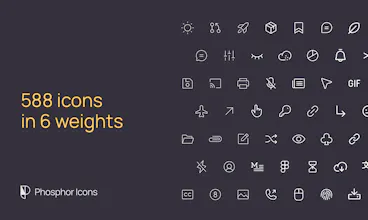


These Phosphor Icons sound awesome! The 6 - weight options and raw stroke info are great. Can't wait to try them out. Looking forward to more details!
very practical 👍