
NGXSMK UI Kit
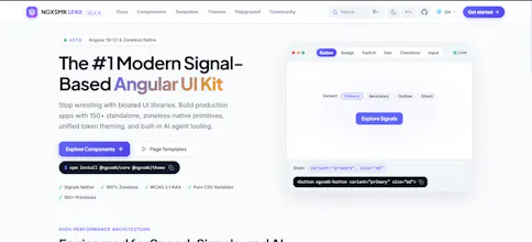
Signals-native Angular UI Kit with 200+ components
5 followers
Signals-native Angular UI Kit with 200+ components
5 followers
NGXSMK UI Kit is an open source Angular component library built for modern applications. It includes 200+ themeable components with support for Angular Signals, standalone components, design tokens, accessibility, light and dark themes, and Angular 17.3+ compatibility. Build dashboards, SaaS apps, admin panels, and enterprise applications faster with a modern developer experience.

Free
Launch Team / Built With


Viktor.comAn AI coworker that actually does the work
Promoted


Angular 17.3+ support is great to see, and the Signals integration is a smart move. One thing that would make this kit even more useful for our team is a set of ready-made chart and data visualization components (bar, line, donut, etc.) that follow the same theming and accessibility standards as the rest of the library. Right now we end up pulling in a separate charting library and reconciling styles every time.
@elifnurkklyhfl Thanks so much for the thoughtful feedback! 🙌
That's a great suggestion and something I've been considering. Having native chart components that follow the same theming, accessibility, and developer experience as the rest of the UI kit would definitely make it more complete and reduce the need for additional libraries.
It's on my roadmap, and if I add charts, the focus will be on lightweight, customizable components with seamless Angular Signals support and consistent styling across the entire kit.
Really appreciate you taking the time to share this. Feedback like yours helps shape the future of the project! 🚀
A solid Angular kit like this would really benefit from a built-in visual builder or playground page where developers can tweak theme tokens and export the generated SCSS variables directly. Right now switching between Figma and the docs to fine-tune spacing and colors feels like extra friction. A live token editor would make it way easier to match brand requirements without digging through config files.
@srazgencilswsc Thank you for the fantastic suggestion! 🙌
I completely agree. A visual theme builder with live previews and the ability to export SCSS variables or design tokens would make customization much more intuitive, especially for teams working with custom brand guidelines.
It's definitely something I'd like to add to the roadmap. My goal is to let developers tweak colors, spacing, typography, border radius, and other design tokens in real time, then export a ready-to-use configuration without editing files manually.
I really appreciate you sharing this idea. Feedback like this helps shape the future of the UI kit, and I can see this becoming a valuable feature for many teams. 🚀
Love seeing standalone components and signals support here, that alone saves a lot of setup time. One thing that would push this further for me would be Figma tokens export alongside the design tokens, so the handoff between code and design stays in sync without anyone retyping values.
@elifnur3asg Thank you! I really appreciate the feedback. 🙌
I'm glad you like the standalone components and Angular Signals support. A Figma tokens export is a fantastic suggestion and would make the design to development workflow much smoother.
It's definitely on my roadmap. My goal is to keep the design tokens as a single source of truth and make it possible to export them directly to Figma, so designers and developers stay perfectly aligned without manually recreating colors, spacing, typography, or other values.
Thanks again for sharing this idea. Feedback like yours helps prioritize features that bring real value to the community! 🚀
Honestly this looks solid, especially the Signals support. One thing that would be really helpful is a Figma library that mirrors the components and tokens so designers can prototype without guessing spacing or color values. Right now devs and designers kind of work in separate worlds with stuff like this, so having them in sync would be a huge win.
@erafettinrqqxz Thank you! I really appreciate the thoughtful feedback. 🙌
A Figma component library is an excellent idea and something I'd love to provide. Keeping designers and developers aligned is incredibly important, and having components and design tokens mirrored in Figma would make collaboration much smoother.
It's definitely on my roadmap. My goal is to offer a Figma UI kit with reusable components, design tokens, and variables that stay consistent with the Angular implementation, making the handoff from design to development much more seamless.
Thanks again for the suggestion. Feedback like this helps shape the future of the project, and I can see this being valuable for many teams. 🚀