Moja UI

Moja UI

FREE top UI kit & design system

0 followers

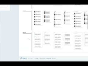
Looking for a Figma UI Kit that isn't ridiculously simple and not very advanced? Moja UI is an easy to use and adequately robust UI library and design system of high quality to help you power up your designs. - 8500+ Easy to use components & variants
Moja UI - Figma UI kit & Design system gallery image
Free
Launch tags:Design Tools•Prototyping•Web Design
Launch Team
Anima - OnBrand Vibe Coding
Design-aware AI for modern product teams.
Promoted

What do you think? …

John Ojanti
Hello all, if you're reading this, thanks for checking this out. I have been working on Design Systems for a fair number of years and anytime I wanted to do some independent work, was faced with a situation of having to pay a premium for Figma Ui kits and design systems that were below par & debatably not worth the cash or free versions that look like they were made in one night of school assignment. Although I found 1 or 2 limited free versions of premium kits that were fairly good, they were exactly that - Limited. So I decided to create one with significant effort, of relatively solid standards and FREE forever. I intend to grow this to be a big as some of the biggest kits out there, and even with kits available on Javascript frameworks starting with react soon. This is just the first version and some things probably need some fine tuning but here I present to you Moja UI. Your feedback patronage and feedback (no matter how harsh 😁) is deeply appreciated. # # # # # # # # # # # # # # # # # # # # # # # # # # # Features - 8500+ Components & variants - 1000+ function icons with size variants ready: 16px, 24px, 32px (adjusted down to stroke width) - 258 flag icons with 2 size variants - Popular brand logos (236) and icons (506) - Responsive typography (adjust/reduce/expand to your taste) - Slim & adequate set of color styles to get you going on your UI project fast. - Autolayout ✔️ ✔️ FREE Lifetime updates (More components and cool features coming) ✔️ Documentation ✔️ Sample/demo components to get you going. ✔️ Content on updated UX best practices for component usage in UI. ✔️ Easily expandable variant structure Components so far Accordions, Alert - Inline, Alert - Sticky, Avatar, Badge(Label/Lozenge), Buttons, Button group, Link, Checkbox, Radio, Chip(Pill/Tag), Date picker, Dropdown menu, Input text, Input group, Input dropdown/Dropdown, List (simple), List (Advanced, Popover, Progress - Bar, Progress - Circle, Slider, Tab, Textarea, Toggle, Tooltip.