401 followers
What do you think? …
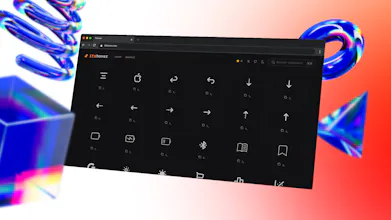
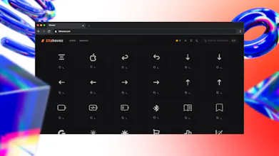
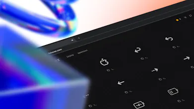
Nice attention to micro-interactions. Small UX details like this really improve user experience.
Good stuff 🤝 any plans to add more icons to the catalog?
Great icons!
Great idea, but it looks quite buggy?
Congrats on the launch!Curious – what was the hardest part to clarify before shipping?


Nice attention to micro-interactions. Small UX details like this really improve user experience.
Good stuff 🤝 any plans to add more icons to the catalog?
Great icons!
Great idea, but it looks quite buggy?
Congrats on the launch!
Curious – what was the hardest part to clarify before shipping?