Fluid for Tailwind CSS

Fluid for Tailwind CSS

Smoother responsive styles in less HTML

8 followers

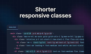
Build sites that look better at a wider range of screen sizes, all while writing less code. Fluid for Tailwind CSS lets you easily generate modern clamp() values with every built-in utility.
Fluid for Tailwind CSS gallery image
Free
Launch Team
PinMe
PinMe
Publish Sites in Seconds. Tamper-proof by design.
Promoted

What do you think? …

Maxwell Barvian
Hi PH, Thanks for checking out my launch! I built Fluid for Tailwind CSS because I'm a big fan of fluid `clamp()` techniques in CSS (https://www.smashingmagazine.com...). From my experience, they tend to make designs look better in a larger range of screen widths without adding a ton of code. Unfortunately, they're hard to work with in Tailwind CSS. The current recommendation (https://youtu.be/CLkxRnRQtDE?si=...) is to include them through arbitrary values, i.e. `text-[clamp(...)]`, or as part of your theme. Both approaches quickly become tedious, though, because you often have to rely on external tools (i.e. https://fluid.style) to generate fluid `clamp()` values, which means they're never fully in sync with your theme. Fluid for Tailwind CSS solves these issues, opening up new responsive possibilities in your Tailwind sites without requiring large (or potentially any) changes to your theme. Here are some of its biggest features: 1. 🛠 Works with every built-in utility: Fluid text and spacing might be all the rage, but what about fluid `scroll-padding` and `column-gap`? Fluid for Tailwind CSS automatically creates fluid versions of every enabled core plugin (https://tailwindcss.com/docs/con...), and even lets you "fluidize" any other plugins (https://fluid.tw/#fluidize-other...). 2. 🤓 Fully customizable: By default, Fluid for Tailwind CSS interpolates between the smallest and largest screen in your theme. Sometimes, though, you want to be able to interpolate between custom screen widths, or even container widths (`cqw`). The plugin provides variants to handle all these use cases. 3. 🔮 IntelliSense supported: The plugin leverages as much of Tailwind's IntelliSense integration as possible. If you have the official extension (https://marketplace.visualstudio...) installed, you'll see suggestions for fluid classes as you type. 4. 📐 Ensures accessible font sizes: With any sharp increase in responsive font size, there's a risk of failing WCAG SC 1.4.4 (https://www.smashingmagazine.com...). Fluid for Tailwind CSS will warn you in the rare case you've unknowingly created an accessibility failure. I hope someone finds this plugin useful ✌🏻 Feel free to share your ideas, experiences, questions, or feedback to any of the above!