
Dayyo
Daily city guide with favs from local businesses & events
18 followers
Daily city guide with favs from local businesses & events
18 followers
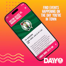
Unlike traditional travel guides that recycle the same year-round tourist spots, Dayyo curates what’s happening today, highlighting local cafés, events, shops, activities, and can’t-miss sights recommended by the people who know them best. With Dayyo’s simple, neighborhood-first design, users won’t wade through endless lists. Each search delivers sets of two handpicked, locally sourced recommendations, helping both residents and visitors spend less time scrolling and more time exploring.


Free
Launch Team / Built With


Customer.ioAutomate Messaging Everywhere — Startups Get 12 Months Free
Promoted


Love this idea! And I appreciate the creative approach to the design — it certainly has a different feel to it than a lot of apps. That said, since it is so unique, I wonder if you could build in a mini tutorial up front to help explain the flow? One thing that I found to be a little confusing was the "Skip to" button. For example, when I press "Skip to let's eat" — is it picking one of these options for me: "like a local," "like a tourist," or "surprise me?" Or is it just not filtering any of those out and keeping all of them?
I hope that feedback helps! (Any plans on expanding to smaller cities??)
@shaun_hurley Thanks for feedback! The Skip to button will keep the same initial filters "like a tourist" etc... we can definitely make that more clear. And yes, we are testing response and usefulness of the app in smaller cities with Worcester and Burlington... we're finding at that moment that it can be tough to give multiple options for recommended events on certain nights in those areas but definitely workable. Next cities will likely still be mostly in the Northeast - with a mix of larger (Pittsburgh, DC, Baltimore) and smaller (New Haven, Hartford). Thanks again for checking us out and for the help!
@geordiemcclelland thanks for the response, and best of luck!
One of the devs on Dayyo here...since using the app I've discovered places and local events I never would've found otherwise. Would love to hear what you all think. What area should we add next?
App designer here
Our goal was to build something that looks different from the usual travel apps — without making it harder to use. The visual identity stands apart, but the interactions are intentionally simple. You should be able to open the app and get to meaningful results in just a couple of taps — no long onboarding, no learning curve.
We also made a deliberate decision to keep the experience free of login or signup walls. People should be able to explore, share, and interact with the app instantly and effortlessly.