
Color Pick Master
Software has been rude for too long. We’re fixing that.
1 follower
Software has been rude for too long. We’re fixing that.
1 follower
Color Pick Master is a lightweight color tool for visual creators, combining palette extraction, intuitive grading, template preview, and professional color controls in one smooth workflow—so you can turn inspiration into a clear, usable color style faster.
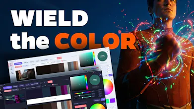


Hi everyone ! — I'm SoroSoro, and Color Pick Master is a tool I built for designers, photographers, illustrators, UI / brand designers, and anyone who wants to use color to build a more personal visual style.
The reason I made it was simple.
When a great image really hits you, you usually don't respond to it because of parameters — you feel the color first. But the moment you try to recreate that feeling yourself, the workflow often turns into jumping between apps, opening panels, and tweaking settings over and over. And somewhere in that process, the first thing you lose is the original feeling you wanted to keep.
As AI keeps making technical execution easier to automate, I think style matters even more. And color is one of the fastest, most immediate ways that style is seen and felt.
So Color Pick Master isn't trying to become another bloated "pro" app. It's built to make the whole color workflow lighter, freer, and much more intuitive.
-----------------------------------------------------------------------------------------------------
What it does
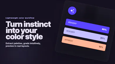
Color module: pull palette inspiration from great work
Drop in images you love and quickly extract their palette themes.
You can immediately understand things like:
color structure
color proportion
HEX / RGB values
a cleaner, easier-to-read palette logic
It supports batch import, quick value copying, saving palettes for later, and exporting palette images with or without the source image.
Tools module: make color grading feel more intuitive
This is the core of the app.
Instead of throwing you into a wall of controls, Color Pick Master lets you shape color more directly with 8 hue channels + 1 global channel. That makes it easier to work with actual color regions and how they behave in shadows, midtones, and highlights — which feels much closer to the way visual creators actually think.
It also includes:
before / after split preview
independent masks for each channel
Hue Mode
Preserve Hue
Saturation Influence
preset import / export
So you can move fast when you're exploring, and still stay precise when you need more control.
Templates module: test color inside real design
A palette by itself is only part of the story. What you really want to know is: does it actually work in a web page, an app UI, a poster, or a promo layout?
That's why the app includes 15 design templates. You can apply your colors right away and see how they hold up in real layouts, which is especially useful for branding, UI, and visual direction work.
Color panel: give intuition proper professional support
Beyond the core workflow, it also comes with:
a professional HSB color picker
large color preview
a screen eyedropper
a harmony-based color wheel
built-in color rules
So you can work by instinct when you want to, and lean on color theory when you need structure.
It's lightweight on purpose
One thing I cared about a lot: I didn't just want something that looked professional. I wanted something you'd actually want to open again and again while exploring color.
So the app focuses on:
fast launch
low memory use
smooth interaction
multilingual UI
light / dark themes
support for common image formats and many camera RAW formats
-----------------------------------------------------------------------------------------------------
If your workflow often looks like this:
find inspiration → extract palettes → shape the look → preview it in real design
then I hope this tool makes that whole loop feel a lot smoother.
And I'd really love to hear from you:
What does your current color workflow look like?
What problem would you most want this to solve?
What would you want me to improve next?
Thanks so much for reading — and if you try it, I'd love your honest feedback.