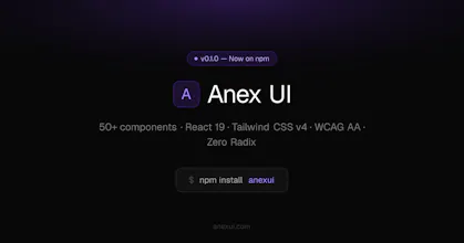
React component library for developers who care about accessibility — without Radix or Headless UI as a dependency. 53 components · React 19 · TypeScript · Tailwind CSS v4 · Dark/light mode · WCAG AA Every component passes Storybook a11y checks (plugin set to error mode — violations fail the build). CLI included: npx anexui add copies component source directly into your project, similar to shadcn's approach. Docs + live examples at anexui.com
Hey Product Hunt! 👋 I'm Debayan, the developer behind Anex UI.
I built this over the last few months because I kept running into the same problem — I wanted accessible components without adding Radix or Headless UI to every small project. So I built them from scratch, learning the WCAG patterns properly along the way.
53 components later, a docs site, a CLI, and a custom domain — here we are.
I'd love to hear what you think. What components are missing? What would make you switch from your current library? Happy to answer anything about the architecture, the a11y approach, or the Tailwind v4 setup. 🙏
Report
No reviews yetBe the first to leave a review for Anex UI