Anex UI
Accessible React components. Dark mode. Zero Radix.
4 followers
Accessible React components. Dark mode. Zero Radix.
4 followers
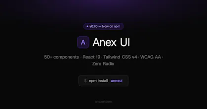
React component library for developers who care about accessibility — without Radix or Headless UI as a dependency. 53 components · React 19 · TypeScript · Tailwind CSS v4 · Dark/light mode · WCAG AA Every component passes Storybook a11y checks (plugin set to error mode — violations fail the build). CLI included: npx anexui add copies component source directly into your project, similar to shadcn's approach. Docs + live examples at anexui.com