
aiboxplot
Free Box Plot Generator
6 followers
Free Box Plot Generator
6 followers
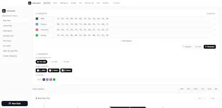
Free AI-powered box plot maker & generator. Create box and whisker plots, violin plots, histograms, scatter plots, and more. Paste your data or generate it with AI. Instant five-number summary, outlier detection, and export to PNG/SVG.


Hey Product Hunt! 👋
I built aiboxplot because I was tired of opening Python or Excel every time I wanted a quick box plot. Most online chart tools either require sign-up, have ads everywhere, or use approximations that don't match what NumPy gives you.
aiboxplot does three things differently:
1. **Correct math** — Quartiles use linear interpolation (Hyndman & Fan method 7), the same as Python's NumPy and pandas. Outliers use Tukey's fences with adjustable thresholds. Notches use the McGill-Tukey-Kramer 95% CI method. I didn't cut corners on the statistics.
2. **Pure SVG rendering** — No D3, no Chart.js, no canvas tricks. Every chart is hand-coded SVG. It's fast, sharp at any resolution, and the rendering engine is https://github.com/terrytyzhang/aiboxplot
3. **Privacy-first** — All computation happens in your browser. Your data never touches a server. There's no database, no tracking, no accounts. Paste your numbers, get your chart, move on.
The AI chat can analyze your results, suggest transformations, and explain statistical concepts — but even that only receives anonymized summary stats, never raw data.
I built it for students grinding through stats homework, researchers who need quick exploratory plots, and anyone who wants to understand their data without fighting with software.
Would love your feedback — especially from statisticians and data people. What would make this your go-to tool?
https://aiboxplot.com
how does the AI data generation handle cases where i need a specific sample size or particular distribution shape, or is it mostly random noise?
@glerdagu
Thanks for the question! In our tool, "AI data generation" uses an LLM to produce a set of numbers based on your description — it's not pure random noise, so you can control both sample size and distribution shape fairly precisely:
1. Sample size — Just ask for e.g. "generate 15 data points" or "20 values per group". Each chart type has a cap (e.g. box plot: up to 20 values/group, max 10 groups; histogram/scatter: up to 20 values). If you exceed the limit, the AI generates the maximum allowed and notes the limit. For larger samples, generate in batches and combine, or just paste your own data.
2. Distribution shape — You can specify it in the prompt, e.g.: "generate right-skewed data with mean ~50" "two groups with a bimodal distribution" "approximately normal data with std dev 10" "a dataset with 2 outliers" The AI constructs values that match the description rather than emitting pure noise. If you need larger, statistically rigorous random samples with precise distribution parameters (e.g. for simulations), we're planning to add native "generate-by-distribution" support — where you'll be able to specify sample size, mean/standard deviation, skewness, and whether to include outliers — built directly into the tool, no external software needed. For now, you can start from our preset sample datasets (temperatures, exam scores, house prices, etc.) or paste your own data.
3. Your own data — Every chart also accepts your own comma/space-separated numbers; the AI will analyze your real data instead of generating new data. Finally, if you run into any issues or have any suggestions, please don't hesitate to reach out — I'm here to help and will fix anything that comes up as quickly as I can.
Hopefully this tool can truly help you.
The outlier detection feels really thoughtful, especially how it surfaces them right alongside the five-number summary instead of burying them in a separate panel. Clean, focused, and it respects the user's time.
@utku1011889 Hi utku, as I replied to duran, I'd like to thank you for your positive feedback first. I've been iterating on the website recently and apologize for not being able to reply sooner. I've made many optimizations during this time: Box plots can now be generated directly from the homepage. I've also optimized and fixed bugs for features such as boxplot, histogram, steam and leaf plot. If you are a teacher, feel free to use this website in your lecture notes. If you have any needs or suggestions regarding this tool, please feel free to leave me a message, and I will respond promptly.
The instant five-number summary showing up the moment you paste data is such a thoughtful touch, saves so much back-and-forth for anyone teaching stats. Clean output too.
@duran257125 Hi duran, thank you for your positive feedback. I apologize for not being able to reply sooner due to ongoing website iterations. I've made several improvements recently: Box plots can now be generated directly from the homepage. I've also optimized and fixed bugs for features such as boxplot, histogram, steam and leaf plot. If you are a teacher, feel free to use this website in your lecture notes. If you have any needs or suggestions regarding this tool, please feel free to leave a message, and I will respond promptly.