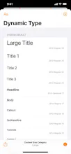
Visualise how iOS’s Size Classes and margins for layout, readable content and the safe area look on real devices and how they change with respect to orientation, iPad Slide Over/Split View and Dynamic Type size changes.
I created Adaptivity back in 2018 to help me better understand default iOS's layout margins and the sizes of different modal view controllers and split sizes with iPad multitasking. The features grew to include views for visualising the iPhone X Safe Area and Dynamic Type sizes.
With the release of iOS 13 I added more views to explore System Colors, System Images and System Materials. More recently, there are views to explore the layout of table views and table view cells and the iPadOS 13.4 pointer interactions.
In the words of Paul Hudson (https://www.hackingwithswift.com...):
“Adaptivity is not just highly recommended – it’s essential.”
Report
I've used this tool for quite some time and it's been a god send as a designer. Hope to see more screens and views on the WatchOS app in the future!
Report
I can see how it's essential. One more step to pixel perfect apps. 👏