Launching today

Diagramly
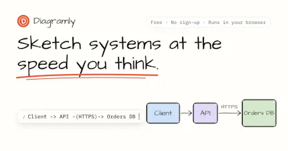
Sketch systems at the speed you think
32 followers
Sketch systems at the speed you think
32 followers
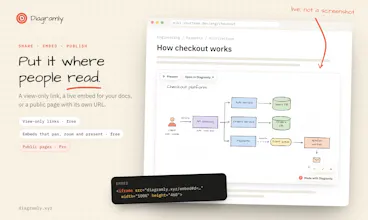
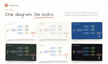
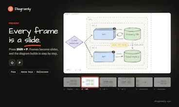
Hand-drawn diagrams and cheat sheets you can type or describe. Write Client -> API -> DB, or ask the AI, and it's drawn and laid out. Six looks, from paper to blueprint to neon. Present as slides, embed in docs, export PNG, SVG or PDF. Free, no sign-up.




Free
Launch Team

ClarifyThe full-stack AI CRM for modern GTM teams
Promoted
@robin_singh33 Typing first and dragging later makes sense to me. In an interview, every minute spent moving boxes is a minute you’re not explaining your trade-offs. Also love that there’s no sign-up, so you can just open it and try....
@mishaal_rashid That's exactly the trap I kept falling into when practicing. You spend 5 minutes aligning boxes and the interviewer still hasn't heard why you picked a queue over a direct call.
Typing keeps your hands busy with the structure and your mouth free for the trade-offs. And no sign-up was a must for me, an interview prep tool shouldn't need an account before you can draw one box.
Thanks for trying it! If you practice with it, I'd love to hear what's missing for interview prep.
six looks from paper to neon 👀 which one do people actually pick? and can i bring my own colors and font so it matches a brand, or is it neon or nothing lol 🫶
@emma_lagast haha
Honest answer on the picks: it’s too early to name a favourite. Notebook keeps showing up in what people save, and lots of people never leave the default look at all. Ask me again in a month and I’ll have real numbers.
On brand: you can already swap the font, paper and stroke style on any of the six looks from the Look button. Your own brand colours and fonts aren’t in there yet. You’re not the first to want that, so it’s high on my list. If you tell me what you’d use it for (slides? docs? your own site?), that helps me build the right thing.
Every system design starts with a simple idea.
But turning that idea into a proper diagram? That’s where the time goes.
You start with a few boxes, drag them around, fix arrows, rearrange services, and before you know it, you’ve spent 40 minutes just drawing.
So I built Diagramly to make that process easier.
Just describe your system in plain English, and it turns your idea into a diagram with services, databases, queues, and labelled connections, organized into sections.
And you can keep refining it through conversation:
“Add a Redis cache in front of the orders DB.”
“Scale the matching service to 3 replicas.”
“Add an SLO checklist next to the API gateway.”
It updates the existing diagram instead of starting from scratch.
There's also a Tidy feature to organize complex diagrams, route arrows around components, and make everything easier to follow.
Once you're happy with it, share a link with your team. The diagram is stored in the URL, so anyone can open it without signing up.
I went with a hand-drawn style intentionally. System designs are rarely perfect on the first try, and diagrams should feel easy to change, question, and improve.
That's what design reviews are all about.
Diagramly is free to start and runs right in your browser.
What would you build first?