Launching today
World Mood Map

World Mood Map

Real-time AI sentiment map of 236 countries and regions.

1 follower

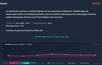
Move beyond headlines. This AI-powered atlas analyzes the global "vibe", mapping world news from Magenta (negative) to Cyan (positive). Now featuring a mobile-responsive legend!
World Mood Map gallery image
Free
Launch Team / Built With
Intercom
Intercom
Startups get 90% off Intercom + 1 year of Fin AI Agent free
Promoted

What do you think? …

Lars Hoff
Maker
📌
Hi Product Hunt! 👋 I'm the founder of Luftling Drohnenfotografie, and while I usually capture the world through drone lenses, I’ve spent the last few months capturing its 'mood' through data. The World Mood Atlas was born from a simple question: Can we visualize the collective sentiment of our planet at a single glance? Instead of reading thousands of individual headlines, I wanted a way to see the 'big picture.' How it works: Every 12 hours, a custom NLP model analyzes international news headlines for 236 countries and regions. - Magenta / Pink indicates a negative news cycle. - Cyan represents a more positive 'vibe'. - Grey shows neutral states or areas where the AI hasn't found enough data yet. Evolution based on feedback: I recently shared this project on Reddit, and the community gave me some very 'blunt' but helpful feedback. The biggest lesson: Data visualization Rule #1 is a clear legend. I’ve since implemented a fully responsive legend that now works perfectly on mobile devices as well. A note on my English: I am a native German speaker. To make sure my technical explanations are as clear and professional as possible for this global community, I use AI tools to help polish my written English. I’d love to hear your thoughts! Does the color of your country on the map match what you’re seeing in your local news today? Happy exploring