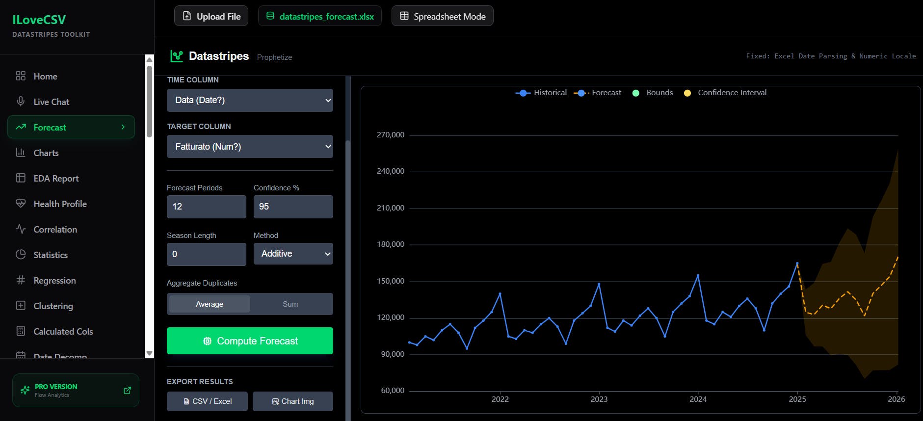
Stop fighting with complex Excel formulas or writing Python scripts just to see a simple trend line.
iLoveCSV Forecast is a free, privacy-first tool that runs entirely in your browser using WebAssembly. Drag and drop your CSV file to instantly generate time-series forecasts and linear regression models.
I ve been so heads-down building, I completely lost track of the calendar. I woke up this morning, checked my notifications, and realized Datastripes Lens is live on Product Hunt... and it s actually going super well!
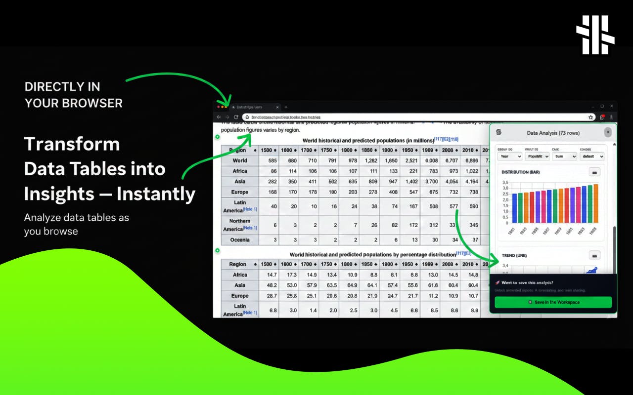
If you haven't seen it yet, Datastripes Lens is your personal data analyst, right in your browser.
Let s be honest for a second: It is late 2025. Why are we still reading cutting-edge science on static PDFs formatted for A4 paper?
We have AI agents writing code, autonomous vehicles, and neural interfaces... yet, to understand the latest breakthrough, we still have to download a flat file, squint at static columns, and imagine how a chart would look if the parameters changed.
iLoveCSV - Data Analysis Tools for CSV and Excel: suite of tools designed to help you clean, transform, visualize, and analyze your data with ease. Just upload your CSV or Excel files!
It's just "iLovePDF" but for CSVs! All in browser and made to speed up boring spreadsheet things
Stop copying data to spreadsheets. Datastripes Lens is a free Chrome extension that transforms boring tables and numbers on any webpage into a powerful gallery of interactive charts with one click. Your personal data analyst, right in your browser.
Big momentum at Datastripes: our community is expanding fast, and a new wave of users is reshaping how data work gets done.
We re seeing consultants and analytics professionals build entire services on top of Datastripes. Instead of long onboarding processes or heavy tool stacks, they re using Datastripes to deliver insights directly, instantly, and securely.
There are many tools that promise magical data analysis with AI, but businesses don't need charts that appear out of nowhere and hallucinations.
Datastripes, despite having text-to-chart capabilities, doesn't want to be a black magician or an oracle: we want people to approach data in a simple, replicable, and aware way.
Process 2GB of data right in your browser. No servers, no costs, ultimate privacy.
Data tools today force you to make a choice: speed or security. You either upload your data to a slow, expensive cloud server or deal with clunky, desktop software. We thought there had to be a better way.
We've completely rebuilt our core engine with WebAssembly (WASM), giving you the power of a desktop app right in your browser.
We can all agree spreadsheets are everywhere, but analyzing them is slow and often requires a data scientist. Teams spend more time cleaning data than actually using it. Traditional BI tools are powerful, but overkill for small teams or solo founders.
During a demo, we realized the platform struggled with 200MB+ spreadsheets. So we rebuilt the core logic using WASM analytical databases and synchronized message channels between workers.
The problem: We can all agree spreadsheets are everywhere, but analyzing them is slow and often requires a data scientist. Teams spend more time cleaning data than actually using it. Traditional BI tools are powerful, but overkill for small teams or solo founders
Our solution: Datastripes. Upload your Excel or Google Sheets and instantly get:
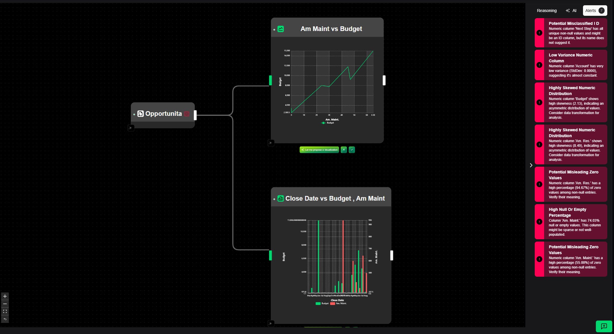
Automated insights: trends, anomalies, and patterns highlighted without manual digging
Instant visualizations: charts and dashboards generated automatically from your data
Narrated reports: each analysis can become a data podcast explaining your results
Direct workflow integration: no code, no setup, just actionable answers
Most beginners are told to start with SQL. It s structured, powerful, and universal. But it trains you to think in rows and joins, not in insights.
If your goal is to explore, transform, and visualize data, SQL can feel like writing essays before you ve learned the alphabet. Modern tools let you drag, drop, and experiment with flows.