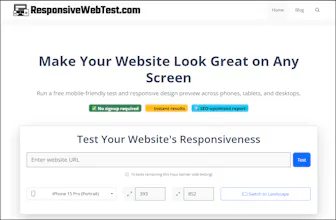
Run a free mobile-friendly test and responsive design preview across phones, tablets, and desktops. ✅ No signup required ⚡ Instant results 🔍 SEO-optimized report
No reviews yetBe the first to leave a review for Test Your Website's Responsiveness Free
Maker
📌
Hey 👋
I built Responsive Web Test because I noticed a gap between quick browser resizing and expensive enterprise testing solutions.
As a developer, I wanted something that could give me real insights - not just show me different screen sizes.
The problem I kept facing:
Testing responsive design properly meant opening multiple browser tabs, resizing windows, checking device-specific issues, and still missing critical problems.
Browser DevTools help, but they don't tell you if your images are actually responsive or if your CSS media queries are implemented correctly.
What makes this different:
Instead of just showing your site at different sizes, we actually analyze your code and give you a responsiveness score based on technical implementation.
We check things like:
- Whether you have proper viewport meta tags
- If your images use srcset and sizes attributes
- CSS media query breakpoints
- Responsive table handling
- Framework detection (Bootstrap, Tailwind, etc.)
Each test generates a detailed report with specific recommendations.
You get both the visual preview AND technical analysis of what's working and what needs improvement.
Two ways to use it:
1. Visit our website for full-featured testing with shareable reports
2. Install our Chrome extension for quick, instant checks while browsing
The Chrome extension is particularly handy - it analyzes any page you're viewing in under 2 seconds and shows you the responsiveness score right in your browser.
Everything is processed locally for privacy.
We've kept it simple and free to use because we believe every website should be accessible on every device.
I would love to hear about the responsive testing challenges you face and how we can improve this for your workflow.