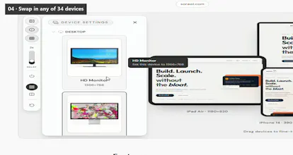
Sorawi Respo renders the same website on desktop, laptop, tablet and mobile simultaneously. Drag devices into position, overlap them, capture the whole canvas, and export as PNG, JPG, SVG, WebP or PDF. Built because resizing a browser window one width at a time is slow and hides comparison.
Hey hunters! š
I built Sorawi Respo out of personal frustration. Every responsive review meant:
1. Open DevTools device toolbar
2. Pick a width, check layout
3. Pick another width, check again
4. Try to mentally compare ā miss the overflow that only shows at 768px
5. Screenshot each, stitch in Figma for the client
Sorawi Respo does it in one view:
⢠Paste URL ā see desktop, laptop, tablet, mobile at once
⢠34 real device presets (Studio Display ā iPhone SE) + custom 240-4096px
⢠Drag, overlap, zoom, toggle frames ā it's a canvas, not a grid
⢠One-click export: PNG, JPG, SVG, WebP, PDF with transparent/white/checkered backgrounds
⢠Share links carry the exact device sizes & arrangement so reviewers see the same view
⢠Free, no signup, runs in the browser
Try it: https://respo.sorawi.com
Happy to answer questions on how the preview relay works (it bypasses most framing blocks), how capture reuses the loaded iframe (no second render), or the export pipeline.
Demo: https://respo.sorawi.com/#check (pre-loaded with sorawi.com so you can play immediately)