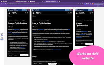
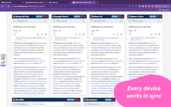
Test your responsive web designs on multiple devices at the same time! Devtools responsive mode - enhanced! Works on live websites and local development sites. Features hot reloading with synced scrolling and navigation to test seamlessly on any website.
Hey makers! Responsive website design is critical - and hard!
Ever wished you could see how your site looks, at all stages of development, on all devices and breakpoints?
What if you could see how it looked on all devices, at the exact same time?
Enter Mobile View! Gone are the days of manually changing device type in devtools, of resizing the browser window, of checking your site on your mates phone. Say goodbye to your BrowserStack subscription, say goodbye to your custom browser solution that costs XX dollars a month.
With this free chrome extension, you unlock the power to quickly test your responsive designs at all stages of development, across a range of common devices and breakpoints, on the browser that the majority of your end users will be using .... Chrome! and soon... Firefox and Safari!
All the devices are synchronised - that means, scrolling on one device scrolls them all, that means, navigation is reflected across all devices - all for free!