
MapBees
Ask a location question, get a map that shows its work
7 followers
Ask a location question, get a map that shows its work
7 followers
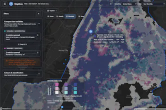
Ask "where should I open a café?" and MapBees answers with a map — and shows its work. It splits a city into hex tiles scored on open map and census data, then lets you read them seven named ways: a score, an amount, a fair share, what's missing, real clusters, variety, two things crossed. Scout Bee, the built-in agent, turns a plain question into one of those maps, says why it chose it, and undoes it on a tap. Territories and Huff market share too. Free Tier.



Hey Product Hunt 👋
Most location tools hand you a score and ask you to trust it. MapBees was built to do the opposite: every number on the map can be clicked open to show exactly which signal helped, which hurt, and by how much.
[One honest sentence on why you built it — the decision you were trying to make, or the tool you couldn't afford.]
Two things make it worth a look today:
1. You can just ask. Scout Bee is the built-in map agent. Type "where should I open a café?" or "which areas have fewer pharmacies than expected?" and it proposes a map — which formula, which data, how the colours are cut — and tells you why it chose that one, in plain words. Apply it with a tap, undo it with another, or take one of the alternative readings it offers instead. It only ever moves the same controls you have, so there's nothing it can do that you can't see, change, or undo. That was the hard constraint: an AI that drives the product, not a chat window bolted onto the side of it.
2. Seven named formulas, in plain words. The same block can be read seven ways, and each one is a real method with its proper name kept next to it: Score (weighted sum), Amount, Variety (Simpson/Shannon), Fair share (Location Quotient), Missing (gap analysis), Clusters (Getis-Ord Gi*, with a real significance test, so only genuinely busy or genuinely quiet areas get a colour), and Cross two (3x3 bivariate). Even how a map is cut into colours is yours to choose — and when you leave it on Auto, it tells you which cut it picked and why, because where you put the breaks is a claim about the data, not a styling choice.
There's also territory drawing (real road-network drive/walk/cycle/transit catchments, not circles) with overlap detection, and Huff gravity-model market share for working out captured, contested and cannibalized demand.
It runs on open data — Overture Maps buildings and points of interest, plus each country's public census data — across 10 countries so far.
What it is not: a sales forecast. It's a fast, transparent first pass for shortlisting, and it says so. If a number looks wrong, click it — the whole point is that you can check.
There's a real Free Tier. I'll be here all day — tell me which formula you want and which city you want it on, and I'll go run it. 🐝
Drew a 15-minute drive-time around a Berlin address and the territory rendering was instant, no lag or signup wall. The Huff model overlay for comparing two overlapping zones is genuinely useful for anyone scouting locations.
@kranurginidsuf Thanks so much for trying it out! Glad the Berlin drive-time render felt snappy — that's the isochrone engine doing real routing, not just a circle drawn around a point, so it's cool to hear it held up on an actual test. And yeah, it's on the Free Tier, so you can just jump in and poke around without any friction. The Huff model overlay is honestly my favorite part too — it's not just "who's closer," it factors in size/attractiveness of each location to estimate actual demand split, which is way closer to how people really choose where to go.
Drew a quick 15-minute drive time around a Berlin café and it matched my commute almost exactly, which was a nice surprise. The Huff model overlay is genuinely useful for figuring out where a new shop would pull demand from.
@ayferi2xd That's awesome to hear, thank you! It's always a relief when the drive-time matches real life instead of just looking pretty on a map lol. That's basically the whole point of building it on routing data instead of straight-line buffers. And yeah, the Huff model is meant for exactly that — figuring out which areas a new location would actually pull customers from once you've got competitors nearby. Appreciate you giving it a real test, means a lot.
love that the drive-time and transit catchments work together on the same map, makes comparing accessibility across neighborhoods actually feel intuitive instead of a spreadsheet chore
@halit1241755 Really appreciate this one, thank you! Yeah, I wanted drive-time and transit catchments to live on the same map instead of being two separate tools you have to mentally stitch together — comparing accessibility across neighborhoods should feel like a glance, not a spreadsheet exercise like you said.
Drew a 10-minute drive-time zone around my favorite bakery in Berlin and the catchment overlap tool instantly showed me which nearby spots were stealing foot traffic. Honestly impressive that something this useful lives behind a no-signup link.